Friday, 28 August 2015

A riot of colour - Prague's Jerusalem Synagogue


Jeruzalemska is a side street in Prague's Nove Mesto, or New Town. It is also home to the Jerusalem or Jubilee Synagogue which stands out from the rest of the street due to its vibrant blue, pink and yellow exterior and its Moorish architectural style. 

I last stood outside this building more than 12 years ago, disappointed to find it closed and without signs of life. This was far from the case yesterday when I had to join a small queue of tourists wanting to enter and there was a steady flow of visitors whilst I was inside. However, I have to say that I didn't take much notice of the other visitors because once through the lobby where there is a small entrance fee, I was overwhelmed by the bright colours with deep reds, blues and yellows, even more vibrant than those on the exterior. Everywhere I looked there were flourishes, curves and geometric designs that surprise and delight. And this isn't just limited to the walls and ceilings - there are also beautiful stained glass windows, patterned ceramic tiles and bright coloured pillars supporting the organ.

Apart from the visual impact, the first thing to strike me was that it must have been a confident and optimistic Jewish community to have commissioned and built this synagogue at the beginning of the 20th century. The Society for the Construction of a New Temple was founded in 1898 following the demolition of the the Ziegner, Great Court and New synagogues as part of the clearance of the former Jewish quarter in Josefov. A site was acquired in 1899 and a series of designs considered including a Neo-Romanesque building designed by Alois Richter and Joseph Linhart's Neo-Gothic proposal.  The preferred Moorish design was that of Wilhelm Stiassny which was approved in 1904. He was responsible for over 180 buildings including synagogues in Malacky, Jablonec and Nisou and the Central Jewish Cemetery in Vienna. He was also the founder and president of the Society for the Preservation and Conservation of Jewish Art and Historical Monuments.


The building was realised by Alois Richter from 1905-6 at the Society's expense and the dedication took place on 16th September 1906 during the festival of Simchat Torah. It has a basilica type triple-nave with two traverse wings whilst the main facade has a large Islamic-style arch and a rosette window with a central Magen David. The window is surrounded with a Biblical quotation from the Book of Malachi "Have we not one father, did not one God create us?". Placing this quotation very prominently on the facade of a large and brightly coloured building may have been another sign of a confident community but could also have been a plea for acceptance for a community caught between competing Czech and German nationalisms. Furthermore the memory of the antisemitic violence of 1899 and 1900 following the Hilsner affair and the revival of the blood libel would still have been fresh.

The synagogue is filled with light filtered through beautiful stained glass windows whilst the aron ha-kodesh, where the Torah scrolls are kept, is decorated with a vine leaf motif and the tablets of the Ten Commandments. There is an organ at the upper level at the rear of the women's gallery. The inclusion of an organ was something that began in the nineteenth century and which provoked strong debate and objections with some Jews viewing this as the Christianisation of services. A rabbinical conference in Leipzig in 1869 considered this matter and afterwards organs were introduced in many synagogues in German speaking areas. 


The synagogue survived the Second World War reasonably intact as it had been used as a store during the long occupation of Czechoslovakia. Most of the community did not survive the war and together with the restrictions placed on organised religion under the Communist authorities and regular  outbursts of star sponsored anti-semitism, there was little Jewish life until the fall of the regime in 1989. In 1992, the community began renovating the building, initially restoring the stained glass windows with funding from the Czech Government, Prague City Hall and from its own resources. Further restoration commenced on the interior walls and furnishings in 2004 and other works still continue.  Visitors are welcome during the summer and there are occasional concerts and exhibitions. The current exhibition focuses on the history of the Prague Jews.

It's taken me 12 years to come back to Prague to see inside this wonderful building. I won't leave it so long until the next time.


Sunday, 23 August 2015

Picture Post 47 - Terraced apartment building in Rue Vavin, Paris


Rue Vavin is a pleasant street of cafes and stylish shops in Paris' 6th arrondissement. It is also home to one of architect Henri Sauvage's most famous works - the white tiled tiered building at number 26. Completed in 1912,  it is one of two tiered buildings he designed and managed to have built - the other being at 13 Rue des Amiraux in the 18th. Number 26 stands out from the rest of the street with its crisp white ceramic tiles and contrasting blue detail - a striking site in the summer sunshine. 

Sauvage was interested in improving the living conditions of ordinary people and wanted to design affordable, well-lit and well ventilated social housing. This is why the building's facade gradually retreats, each level having a terrace, affording outdoor space to the residents and the opportunity to take fresh air without having to go down to the street. It also provides opportunities for tiny gardens and several of the apartments have plants growing on the terraces.  Sauvage's designs were a response to the over-crowded and unhealthy living conditions of the urban poor and in line with his commitments to the Societe des lodgements hygeniques a bon marche - a company established to promote sanitary and affordable housing - something we are still struggling with today. He also worked closely with the City Council's Office of Affordable Housing (HBM) in order to implement his ideas.


He further developed his ideas of healthy living with the building in Rue des Amiraux, a pyramid style building which has a swimming pool in the centre. However, Sauvage cannot take credit for the pool - he originally wanted to place a cinema there but the HBM insisted that the pool, known as the Piscine des Amiraux be provided for residents instead. The building has been renovated and is now listed. It has also been used for filming, in particular for the award winning film Le Fabuleux destine d'Amelie Poulain, better know in the UK as Amelie. The apartments here were completed in 1925 and the piscine in 1930. 26 Rue Vavin also has a film pedigree and was used for the 1972 film - Last Tango In Paris.

Although there were plans and proposals for further terraced buildings, none were realised and in later years, ironically there were issues of poor lighting in some of the apartments. Despite this, Sauvage's ideas have clearly had an impact on social housing architecture and policy in the 20th century whilst his ideas about access to light and air fit well with those of some of the British public health pioneers of the same period, including Dr. Salter and the pioneers of the Peckham Experiment in London. 

Sauvage worked in a number of styles and designed homes for the wealthy as well as social housing. One of the most successful French architects of the first half of the 20th Century, his other works include Villa Majorelle, an art nouveau classic in Nancy, built for the furniture designer Louis Majorelle, a 1933 re-working of the iconic La Samaritaine department store and an hotel in Monterey, Mexico.


Friday, 21 August 2015

Villa La Roche - Le Corbusier's design for a Swiss art collector


My recent Paris trip had a bit of a Le Corbusier theme to it. I began by seeing one of his early works, Villa Planeix on Boulevard Massena in the 13th arrondissement which was completed in 1928. I followed this up by  visiting one of his even earlier works - Villa Roche in Square du Docteur Blanche in the glitzy 16th, completed in 1925. The Villa is open to the public six days per week and visitors are free to wander the interior alone and even to take photographs. To complete, I managed to visit the Le Corbusier: Mesures de L'Homme exhibition at the Pompidou Centre

Tucked away behind a gate and along a gravel drive, Villa Roche is not visible from the street and is announced only by a simple plaque on the front gate. However, as one progresses along the gravel path, the Villa gradually reveals itself, first with the stilt-mounted gently curved facade and tiny box balcony and then, as visitors reach the house, the view of the double heighted window above the atrium and of the covered roof terrace. And then you go inside!

The house was built between 1923 and 1925, commissioned by Swiss banker and avant-garde art collector Raoul la Roche with a brief to design a home and a space to display his collection. Le Corbusier and La Roche had much in common. Both were Swiss born but chose to live in France. Both had a love of modern art and both were involved in the production of the artistic journal L'esprit Nouveau. Their friendship lasted into later life and indeed Le Corbusier wrote a dedication in a copy of his book L'Atelier de la Recherche Patiente, saying that Villa Roche had sealed their friendship and proved that their aims were "…clearly identified, innovative and creative…".


Le Corbusier acquired two plots of land on which to build the villa, as well as a second project - a villa for his brother, Albert Jeanneret which now houses the archive of the Le Corbusier Foundation. 

Wandering through the Villa la Roche, the first thing that visitors see is the ground to roof atrium, which has the possibility of views from the ground floor, at mezzanine level and from the upper level too. The space is flooded with natural light from the window that runs the entire height of the upper floor. There is also a small balcony at the mezzanine level which affords views down into the atrium and over to the bridge that crosses this space. The balcony is echoed with a similar protrusion on the exterior of the building and is a feature that can seen in many of the architect's works.

In the rooms accessible to the public, it is possible to see some items of furniture although most of the original furnishings shown in photographs from the 1920's are either not displayed or long gone. The original furnishings included a collaboration between Le Corbusier and designer Charlotte Perriand. This resulted in three chrome plated tubular steel chairs - one for conversation, one for relaxing and a third - a chaise longue recliner - for sleeping. Perriand was inspired by Le Corbusier's approach to architecture and went on to design furniture for some of his other projects including the Swiss Pavilion at the Cite Universitaire and the Paris Salvation Army headquarters.


One of the highlights of a visit is the art gallery, with its long, narrow and curved structure, beautiful black table and elegant glass and wood cupboards. However the star of the show is the steep and narrow ramp that leads to the upper level which originally housed the owner's library. I love its dramatic sweep and the contrasting brown colouring set against the whiteness of most of the house - both interior and exterior. The whiteness is also relieved by splashes of pale blue on some of the walls and the green tint of the glass cupboard doors. 

By 1927, Le Corbusier had firmed up his architectural philosophy - Five Points towards a New Architecture. Although Villa La Roche precedes this, the elements of his philosophy are played out through this building. First the pilots (or stilts) which allow full implementation of the principle of open plan with residents and guests able to roam freely including underneath the house. He extolled the virtues of reinforced concrete and its contribution to his theory of open plan saying "Reinforced concrete has given us pilotis. The house is in the air far above the ground; the garden runs under the house; it is also on the house, on the roof".

His second point relates to the long horizontal window on the facade. Of this point he wrote that "The window is one of the essential elements of the house. Progress brings liberation. Concrete is revolutionising the history of the window". The third point refers to the roof garden and says that it redefines the traditional roof as a suspended garden at the top of the building. His fourth point returns to open plan and maintains that this approach liberates the internal space making each level and its spatial distribution entirely independent. The fifth and final point refers to an open facade which allows the windows to run uninterrupted from one end to the other.

Clearly all of these elements can be seen in Villa La Roche and were then further defined in his later works. Of course, as with any architectural project, the real measure of success is how well the client responds to the finished product. La Roche wrote to Le Corbusier that "By entrusting you with the construction of my house, I knew that you would produce something wonderful; my hopes have been far surpassed. My independent way of life meant that I left you alone to create this project, and given the result I praise myself for having done so". Can't get better than that. 


Tuesday, 11 August 2015

Ladybird By Design - books for children and a step back in time

Ladybird By Design, the exhibition currently showing at the House of Illustration in Kings Cross brings back many childhood memories for me. I was an odd child, interested in books, maps, history, the world and things that seemed very exotic and inaccessible to a child growing up in a small seaside town in the North-East of England. I don't remember there being many books in our house and we were not regular library users, which is odd given my later career path. However I do remember having a small number of Ladybird books which were probably purchased in the town's branch of WH Smith and which were treasured possessions to the extent that I remember taking them to school to show my teacher and her being a little surprised to find me reading Warwick the Kingmaker!


Ladybird publishing celebrates its centenary this year. I must admit I was surprised to learn that the company is still with us and still producing children's books. The iconic ladybird logo was registered in 1915 by Loughborough printers Wills and Hepworth who experimented with producing illustrated books with an educational focus for young children but the fifties and sixties were the golden age of Ladybird publishing for children. Produced to a winning and at the time ground breaking formula, the books featured one page of text followed by a full page illustration, no matter what the subject. Editorial director, Douglas Keen recognised the importance of layout and illustrations and commissioned leading artists and illustrators for the many series published by Ladybird.

Keen was the reason for much of Ladybird's success during its golden age. He first worked for Wills and Hepworth as a salesman in 1936 and returned to the company in 1946 after spending six years in the RAF as part of a mobile radar unit during the Second World War. Traveling widely as a company rep he spoke to teachers and booksellers to discover what kind of books British children wanted and identified a need for well illustrated, easy to read factual books. Convincing his employers that this was worth pursuing through producing a prototype books on birds, illustrated by his mother-in-law and producing the text himself, he laid the foundations of a phenomenally successful series of books.

As well as producing interesting non-fiction for children, Keen oversaw the production of the Key Words reading scheme series, which may seem old fashioned now, but which was used to teach many children to read from the late 1940's until the mid 1970's, not just in the UK but overseas as well. One of my friends from the Far East reports learning to read with this series under the direction of parents and starting school already literate. I am not one of those many children taught to read with this scheme. I was damned to the boredom of the Janet and John series and its dire text. I can still remember some of the text from those books - "Look John look, the dog has the ball, the ball goes up up up". Tedious in the extreme and I often wondered why the ball never came down down down, but I did learn to read as did thousands of other children with schemes such as these. 

It is easy to underestimate how revolutionary these books were. Children's publishing today is bright, colourful and exciting but until the early 1960's many books for this age group were fairly dull with dense text and limited, often poor quality illustrations. I remember ploughing my way through a copy of the Water Babies at age 10 or 11. Not a picture in the book and very long passages without obvious places to pause - it was a miracle I got to the end of it, especially as most of it was read after lights out by holding the corner of the curtain open with one hand to let light in whilst holding the book with the other.

Over time Ladybird developed a wide ranging list with series on historical figures, travel, machines, people's jobs, Bible stories, achievements, fairy tales retold, science and of course animals. The natural history books were particularly charming and designed to promote a love of natural history amongst children. I particularly liked the "What to look for.." series with one each for winter, spring, summer and autumn. This series was illustrated by Charles Tunnicliffe a well known hand much respected painter of birds and animals. A further wildlife series was published in 1972, with a focus on conservation included "Disappearing Mammals" and "What on earth are we doing" amongst the titles. Disappearing Mammals commented that "Man has no right to rob future generations of the interest, inspiration and beauty that can be had from contacts with animals". It is fashionable in some circles to sneer at publishing from this period as old fashioned or as having a narrow view of the world. Some of these books stand up rather well to this kind of criticism when closely examined.

However, the travel books are perhaps not so able to stand up to this kind of scrutiny. The Flight series included six titles - Australia, Canada, USA, India, Africa and the Holy Land. I was the proud owner of at least three of these - India, the Holy Land and Africa. This series featured Alison and John, a brother and sister who appear to have been frequent flyers with their businessman father. Published in the early 1960's this kind of travel must have seemed enormously exciting for most British children and something few could aspire to. These children were well behaved and quite serious - John took notes in his notebook, Alison did drawings of where they had been and at least in the case of the Holy Land title, was constantly armed with her Bible from which she would read about the places they visited. The father was very engaging, asking the children lots of questions and explaining key moments in the history of the places visited.


This series has received particular criticism. The family see the world from a very white and very British point of view. The depiction of local people in the books in a number of cases would not be acceptable today - a theme further developed in the way women are dealt with in other series. Over time this began to change, especially during the late 1970's and beyond but by that time the bubble had burst, children's publishing had changed and the Ladybird approach had become old fashioned.

Despite this very British approach, the books were translated into a number of languages and were successful overseas. The books have been translated into up to 70 different languages as diverse as Arabic, Chinese, Icelandic, Malay, Swedish, Welsh and Zulu. At least some were translated into Esperanto - the international language created by I.L Zamenhof in 1887 (and which never took off) whilst others were produced using ITA - the initial teaching alphabet which was a method of teaching reading popular in the 1960's. 

Marketing was a key element to the success of the books with Ladybird being one of the first lists to produce its own point of sale and promotions material. The exhibition at the House of Illustration includes a letter from a bookseller asking for more such material and a different range of books to display having sold out his previous stock.

Things change. The world moves on and Ladybird has developed and modernised its approach whilst keeping some of the key features of its early success.  I recently re-purchased a couple of titles that I once owned - Flight Four - India and Flight Six - The Holy Land. I spotted them on Amazon for a couple of quid each and couldn't resist having another luck. Dated yes, innocent seeming certainly, but they still carry a certain charm and innocence and it is not difficult to see how children of the pre internet, i-Phone, modern picture book and Harry Potter age would be drawn to them.

The exhibition runs until 25th September and the gallery shop is selling old and new ladybird titles as well as postcards, posters produced for the exhibition as well as the new book by Lawrence Zeegan Ladybird By Design.


Friday, 7 August 2015

An early Le Corbusier, a former cinema and a chance discovery - More Paris Modernism

Paris surely has one of the largest collections of modernist buildings of any city in Europe if not the world. Each time I am there I discover further examples of this architectural style, many of them in the less central arrondissements. My visit last weekend was no exception. 

216 Boulevard Raspail, 1934, Bruno Elkouken
The apartment building at 216 Boulevard Raspail is a stunner. Built between 1932 and 1934 for Helena Rubinstein to the designs of the Jewish, Polish born architect Bruno Elkouken, it originally included a cinema and artists' studios as well as apartments. Rubinstein retained one of the top floor apartments for herself. The cinema, Studio Raspail, closed in 1982 but the main entrance still retains the name. 

The upper floors have squared off bay windows with the facade showing some cubist features. However, the ground floor is my favourite with its rule of three canopy, glass bricks, integral lighting, and most of all, those beautiful curved rooms to each side of the entrance, one of which may once have been the cinema ticket office. The building's stylishness is further enhanced by the black stripe on the ground floor which contrasts with the cream and white of the rest of the facade.

Elkouken left Poland for Germany in 1929 and also spent time in Italy and before settling in Paris where he designed two other apartment buildings. He left for the United States in 1937, returning in 1940 to volunteer for military service. Remaining in France after the war he eventually gained citizenship and was involved in reconstruction of Dunkirk.

216 Boulevard Raspail, 1934, Bruno Elkouken
Elkouken was not the only Jewish architect working in the modernist style in Paris during the 1930's. Germain Debre was the son of Simon Debre, Chief Rabbi of Neuilly-sur-seine. He graduated from the Ecole des Beaux Arts in 1920 having had his studies interrupted by ten years of military service, including serving during the First World War. Amongst other works, he designed the exquisite Villa Glodek in Rue Miguel Hidalgo in the 19th arrondissement. Built between 1930 and 1932, it was constructed around a reinforced concrete frame with plastered bricks and has a distinctly nautical feel with a porthole over the front door and ocean liner balconies at the upper levels.

If your French is good enough (and it will need to be much better than mine), you can read more about Debre's career here where you can see plans and images of some of his other works. Rue Hidalgo is located on the extension to line 7 of the Paris Metro - ligne 7 bis - and is a short walk from the Danube station. It is well worth a visit, not only for Villa Glodek, but also for the several tiny streets running off Hidalgo that make the area resemble a country village. Villa Claude Monet is especially beautiful and the whole area is worth spending an hour or so exploring.

Villa Glodek, 1932, Germain Debre
Boulevard Massena in the 13th arrondissement is home to two outstanding modernist buildings. I went there to see Villa Planeix at number 24-26a. Completed in 1928, it was designed by Le Corbusier and his cousin Pierre Jeanneret for the sculptor Antonin Planeix. The stark facade faces a busy dual carriageway but is protected from the noise of the traffic by a solid almost windowless bay feature and a protective fence that does not appear to be original. The bay is topped by an elegant balcony, partially shielded from the elements by a very neat and very small central canopy. It is difficult to get a clear photograph of the whole Villa without taking the risk of crossing the dual carriageway and standing beside the tram lines that run up the middle of the road. I decided to risk it and came away unscathed!

The Villa has a roof garden, double heighted atelier and external walkways and staircases. It was originally built on stilts in true Le Corbusier style, but Planeix asked the architects to fill up the ground floor void with two studio spaces that he could rent out. This was because the costs of construction were almost double those of the original budget. Its good to note that spiralling costs is not just a problem for those of us commissioning new buildings today. The Villa stayed in the hands of the Planeix family until 2013 when it was offered for sale. You can see some internal views here. One of Le Corbusier's earlier and lesser known works, it is one of a series of villas he designed for artists to live and work in. Better known is the villa he designed for artist Amadeo Ozenfant in Avenue Reille in the 14th arrondissement.

Villa Planeix, 1928, Le Corbusier and Pierre Jeanneret
Emerging from the Porte D'Ivry metro station on my way to Villa Planeix, I came across a beautiful school built between 1933 and 1937. It appears to have retained many of its original external features including exquisite lettering over the separate entrances for boys and girls, glass bricks in the canopy - some of which are in different colours (and need a good clean!) - and ornate doors. 

The school was part of a programme of building to improve the moral and physical wellbeing of children from poor families and amongst other things emphasised hygiene as a means of improving the lives of the pupils. The architect was Edouard Crevel whilst the external sculptures were the work of Rene Letourner. There is a plaque by the entrance which serves as a heartbreaking testimony to the murder of more than 120 Jewish children deported from the 13th arrondissement between 1942 and 1944, including several pupils of this school. 

Crevel became the chief architect of the city in 1935 and amongst other things was responsible for the development of Parc de Choisy. Earlier, he had worked with Jean-Paul Decaux on producing the winning design for a tuberculosis sanatorium - the Sanatorium d'Aincourt, completed in 1933 - also in the modernist style. During the German occupation of France in the Second World War, the sanatorium was used as a concentration camp. Crevel remained in France during this period and appears to have worked on at least one project for the collaborationist Vichy government.

School at Porte d'Ivry, 1937, Edouard Crevel


Villa Schempp is tucked away in Rue Gauguet, a cul-de-sac in the fourteenth arrondissement, just five minutes away from Villa Seurat, a small street full of modernist buildings that were once home to some of the last century's greatest artists such as Dali, Derain, Soutine, Orloff and Henry Miller. Villa Schempp was designed by architect Marcel Zielinski and was built between 1928 and 1931. He designed adjacent properties at numbers 5 and 7, both with large skylit workshops letting in enormous amounts of natural light and windows and balconies designed to emphasise the verticality of the building. Number 5 was built for American art dealer Theodore Schempp whilst the German artist Hans Hartung had a studio there for many years. The Russian born French artist Nicolas de Stael produced a work in response to number 7, entitled Rue Gauguet, which hangs in the Museum of Fine Arts in Boston.

My final modernist experience on this trip was to visit Villa La Roche, another Le Corbusier building now open to the public and part of the Fondation Le Corbusier which I will write about separately. And Paris still has many more art deco and modernist treasures waiting to be discovered on my next visit. 
Villa Schempp, 1931, Marcel Zielinksi.

Monday, 3 August 2015

Rue Cremieux - another Parisian secret


Last year I wrote a short piece about some of Paris' less well known streets and the pleasure of strolling around the city discovering its many secrets.  Last weekend I was back in the city and have a new favourite to add to my list.

Rue Cremieux is a narrow, pedestrianised street, just off Rue de Lyon and a short walk from the mainline railway station, Gare de Lyon. The area surrounding a mainline station can often be a bit seedy, the streets a bit dirty and not particularly welcoming and those around Gare de Lyon are no different which is why Rue Cremieux is so special and such a welcome diversion from the noise and traffic of its neighbours.


This quiet street is a riot of colour with almost every house painted in vibrant green, yellow, purple or pink, whilst the plainer ones have contrasting colours for the doors and shutters set against white or cream backgrounds. Several of the facades feature witty images such as a cat chasing birds or metal signs featuring cats or geese. My favourites are the green painted house at number 21 with the tree painted across the facade and the purple painted house next door at 23 with the tiny birds and faux porthole. Number 21 also has some rather nice low level railings protecting the windows at both levels.

Dating from 1885 and originally called Avenue Millaud after the banker, entrepreneur and media man Moise Polydore Millaud, the street is lined with 35 small houses, each of two storeys and all to a similar design. Flooded in the Paris floods of 1910, there is a plaque at number 8 that shows the height reached by the waters before receding. Monsieur Millaud published Le Petit Journal a Parisian penny newspaper  which ran from 1863 until 1944, featuring news, politics and serialised novels often in the detective fiction genre. The  street's current name dates from 1897 and commemorates the French politician Adolphe Cremieux who amongst other things was responsible for the 1870 decree that granted French citizenship to the Jews of Algeria.  Cremieux also played an important part during the Paris Commune, taking up the cause of the workers. When built, each of the houses had a basement kitchen and two floors of living space with an annual rent of 700 Francs (about 100 Euros or £70 at today's exchange rates), so I am not sure that many workers could have afforded that at the time. 


The street has retained its residential purpose, the only exception being a hostel - L'Hotel Particuler at number 15. Its great that Rue Cremieux has not fallen pray to some of the shady businesses that surround it and has even resisted the temptation of allowing a cafe…although a little place for the locals would, I'm sure, be very nice. Coffee, pastries and all that, but of course, one business leads to another. The street is not just home to humans. I saw two cats during my visit - a small  brown and white one trying to catch flies and "hunting" between the many plants and shrubs that sit outside each of the properties and a very large marmalade cat having a sleep outside a red door. Rue Cremieux is a little piece of peace amongst the bustle of one of the world's greatest cities.


You might also like - Secret Paris

Sunday, 19 July 2015

Picture Post 46 - The White House, Modernism in North West London


Downage is a quiet, tree lined residential street in Hendon, North-West London, not dissimilar to many other streets in this part of the city. However, number 72, also known as The White House stands out from its neighbours as the only modernist structure in the street and one of the best examples of 1930's style moderne. Completed in 1935, it was designed by architect Charles Evelyn Simmons for Haymills Ltd, builders and developers active in North London during the 1930's and with a reputation for providing quality homes designed by interesting architects. 

The exterior appears to have been perfectly preserved and the house is protected through its Grade ll listed status achieved in 1997. A two storey building, it is constructed of rendered brick with a flat asphalt roof. Built to a square plan it has rounded corners on the south elevation with continuous windows on the ground and first floors. There are double entrance doors set back behind fluted mouldings to either side with a sign bearing the name of the house at the foot of a balcony above. Like many buildings of this style, the White House gives off a slightly nautical or seaside feel with the sun room resembling a ship's look out post. The stairwell is glazed giving passers-by a glimpse into the life of the occupants and topped by a motif inspired by the art deco "rule of three" inspired by decorative elements of Ancient Egyptian art.

According to the listing text some of the original internal features have been lost, including a fireplace in the drawing room, but others survive including taps inside the bathroom wall and a green inset soap holder. A shame we can't see them! The house has six bedrooms and a substantial garden at the rear. It is possible to see some pictures of the interior here

Simmons was a local man, born in Hampstead in 1879 and educated at University College School before being articled to architect Horace Field between 1899 and 1903 where he completed his professional training. He commenced practice in 1905 but was not elected as a Licentiate of RIBA until 1912 with Field as one of his three proposers. He then established a professional partnership with his former tutor until 1915 when he commenced work in the Ministry of Health Architects Department, resuming private practice after the First World War. In addition to designing residential properties, he was also responsible for two churches in Scotland.

Its surprising what you can find in a quiet London street.

You might also like Metroland Modernism - Stanmore's Valencia Road and the Kerry Avenue Conservation Area and More From Metroland - Amersham's High and Over and the Sun Houses


Friday, 17 July 2015

Avishai Cohen's New York Division at the Barbican


Avishai Cohen and his New York Division played the Barbican last night. They took us on a musical journey that included stops at several of his albums - from the very first to his most recent, displaying influences from be-bop and classical music and ending with a series of songs in English, Hebrew and Spanish. 

Over the years I have been to many of his concerts and every time there is something new and different. He has given us jazz quartets, jazz with strings, experimented with songs in a variety of languages and now we have the New York Division which adds three more world class musicians to his most accomplished trio. For slightly more than two hours last night our Avishai was accompanied on stage by Kurt Rosenwinkel on guitar,  Steve Davis on trombone and Diego Urcola on trumpet, the line up being completed by trio members Nitai Hershkovits on piano and Daniel Dor on drums.

Entering the stage in darkness to cheers and applause it was straight into the music with songs from the current album From Darkness, including Ballad for an Unborn and Amethyst (and I think Signature as well?), a good long workout of Shuffle from the Colors album of 2000 and an even earlier piece from his very first album - Bass Suite #2 from Adama, released in 1998. I especially enjoyed this reference back to his early solo days which he played to open the second set, accompanied only by messers Davis and Urcola in a short but engaging interplay between the three instruments. Throughout the evening, there were clear references to classical music as well as middle eastern and other influences and for me there are echoes of both early music and the streets of Jewish Spain before the expulsion in 1492.

The second set/ lengthy encore (for which thanks!) included a vocal version of the old Nat King Cole classic Nature Boy (revived in the 1970's by George Benson-  also a classic). Singing in English, it was an emotional reading of a mystical song and one which Cohen has yet to record. He teased the audience by saying he would - which was responded to with a cry of "do it". I hope he does.  This was followed by my favourite track from his Aurora album - Alon Basela, sang in Hebrew and inspired by his father. The title means an oak tree in a rock and the lyrics are about staying firm through adversity. I like the tense, urgent feel of the song and the way his voice becomes an additional instrument in the performing of it. I loved the physicality of his performance of this song, with much drumming of fingers on the bass, providing his own percussion. 

No Avishai Cohen concert is complete without at least one song in Spanish and or Ladino and we were treated to a salsa influenced piece with euphoric Latin influenced piano playing from Hershkovits and the sharpest trumpet playing from Diego Urcola. Urcola's playing was for me one of the highlights of the evening - I've already been on Amazon looking for his albums! Still in a Latin theme, we then had a solo from Cohen as he performed the Argentinian song, Alfionsina Y El Mar before the ensemble rejoined him for a lengthy and riotous reading of Gershon Beat from the At Home album, which I still think is one of his best. Each of the musicians were showcased in this final number including Cohen displaying little known percussion talents using drums ticks on his metal music stand to accompany drummer Daniel Dor. Dor stood out with a magnificent solo that left the audience cheering and him exhausted! 

British audiences love Avishai Cohen and received several standing ovations, calls from the auditorium for favourites to be played and murmurs of recognition of most of the numbers and he can play an audience in a small intimate like Ronnie Scotts or a large auditorium such as the Barbican to equal effect. He is currently working on fusing jazz and classical music more closely and will premiere this work in Sweden in September with his trio performing with the Malmo Symphony Orchestra. Let's hope he brings this show to London soon, oh and Avishai - don't forget about recording Nature Boy too!

Monday, 13 July 2015

In the Unlikely Event - Judy Blume at London's Kings Place.


When I worked in libraries during the 1980's and 1990's, Judy Blume was the author of books for young adults, especially girls. A trail blazer, her books covered just about every subject a teenager might feel anxious about - love, sex, divorced parents, racism, loneliness, bullying and what was referred to in my day as "maturing". Judy's were the books young people read when they couldn't ask their parents or teacher about something and were too embarrassed to ask their friends. And not only were these books that could help, they were damn good stories too. She was also the inspiration for a whole generation of writers who now deal with these and other issues that are part of growing up.

I have clear memories of taking some of her books into local secondary schools as part of book week promotions and also as part of the long since (and foolishly) abandoned "wider reading" element of English GCSE that was so exciting in the 1980's. The wider reading scheme took themes of interest to and impact on young people such as bullying, friendships, family, etc. The students were encouraged to read books by different writers on these themes and several of Judy's books were used in this programme.

Last night, I had the unexpected pleasure of hearing Judy Blume speak about her new novel, In The Unlikely Event - her fourth books for adults, although as she pointed out, there is no reason why a teenager couldn't read this book too. Impossibly elegant and amazingly now aged 77 (which she doesn't look and which she told us, she doesn't feel), Judy entertained a large and enthusiastic audience at Kings Place, courtesy of Jewish Book Week which takes place each February but also arranges events throughout the year. Without giving away too much of the plot, she explained that the new book was inspired by real life events that took place in Elizabeth, New Jersey during the 1930's, where in the course of a year, three commercial planes crashed within the city's boundaries. She cleverly uses contemporary press coverage of the crashes and other non-related events to illustrate the story which revolves around the impact of the crashes on three different Elizabeth families.

She told us that the story only came back to her very recently when hearing about the 1950's more generally - a decade she had previously thought boring and now finds fascinating. Such great material for a writer and in her own home town. She admitted that her daughter asked her why she hadn't written about this sooner. Strangely, Philip Roth was from the same town and has also never written about these events, although she explained that he would have been away at college at the time. As with many of her books, In The Unlikely Event pays attention to the position of women which was very different in 1950's America with clear roles - we might even say rules - for the behaviour and expectations of men and women.

There were many questions from the audience. Inevitably there were questions about Forever, her most controversial book for young adults, first published in 1975 and which addressed the issue of teenage sex in a more direct way than had previously been seen. Teenagers, especially girls, borrowed this book from public libraries in their millions and at least in the local authority I worked for, we were only able to give it to young people aged over 13, although we knew that many younger girls borrowed it on an older sibling's library card! When asked what had driven her to write this book, she explained that previously any book that included under-age sex or sex outside of marriage ended with a terrible punishment for the girl - death in childbirth, driven out by her family, forced to have the baby adopted or in at least one case being forced into a disastrous marriage. Her daughter, a very committed reader asked her to write a book that included love and sex but where no-one dies! Forever was the result.

Other questions included, the almost inevitable request to write a book about the lead character of Are You There God? Its Me, Margaret showing the teenage girl at 50 and dealing with menopause! She told us this will never happen as she has frozen Margaret at that age and that after each book she moves on, having completed the story and looks for new subjects and characters. One of the younger audience members asked her a very mature question - how does she make sure that when writing for young people, she doesn't patronise them. A tough question but with a great answer. She avoids patronising her readers by living the part of the character, being them, talking about them to her family at dinner and being the character rather than the writer. 

The session lasted for ninety minutes and about half of that was taken up with questions. She was extremely comfortable with her audience as were they with her and she happily shared several personal stories with us. I liked her relaxed style as she took a range of questions, all of which she treated seriously and to which she gave considered answers. It was easy to feel that you knew here and also to understand the impact she has had on the lives of million s of young people. Returning to work today and telling colleagues about the event, several of them recalled having read her books as teenagers - and not just Forever - Blubber, Starring Sally J. Freedman as Herself and Fudge also got mentioned. And that's another thing - she always has great titles for her books.

What a treat of an evening, and now for another treat as I settle down with the new book. Thanks Judy Blume!

Wednesday, 8 July 2015

Milano 2015 - a day at the Expo

I recently visited Milan for the first time and whilst there had the chance to spend a day at Expo Milano 2015, which has chosen Feeding the planet, energy for life as its theme. 145 countries are represented at the Expo, many with their own stand alone pavilion whilst others have grouped together in regional clusters or under particular themes - including coffee and chocolate - each of which have several countries exhibiting on the same theme but showing different approaches to production. What a treat!

Waiting to get into Ecuador's pavilion
The pavilions are set out in a temporary boulevard, 1.5 kilometres long and the whole site covers 1.1 million square metres of exhibition space. 20 million visitors are expected before the Expo ends and there were many thousands of visitors on the day I attended. The gates open at 10 am and I made a point of arriving very early in order not to have to wait. This was a good decision as there were already lengthy queues at the ticket desks half an hour before opening - I bought my ticket in advance!

One of my main reasons to visit was to enjoy the architecture of the pavilions. I was not disappointed. There is an extremely eclectic mix of styles and approaches ranging from the austere modernity of the Sudanese pavilion, to the inventiveness of the Polish structure, and lets be honest, the crassness of some that shall remain nameless!!! It is hard to pick out favourites to feature so what follows are just a few of my the highlights. 

Entering the Expo site one of the very first pavilions visitors come to is that of Brazil. A long queue had already developed here within half an hour of the gates opening. Designed by Arthur Casas and Marko Brajovic, the structure included a netting walkway suspended above the floor of the pavilion, from where visitors can look down at the plants growing below. The accompanying exhibition illustrates Brazil's approach to research in models of consumption and production, combining technology, culture and society. 

Brazil's pavilion
A little further along the boulevard, the Israeli pavilion explored similar themes. The presentation covered Israel's significant contribution to developing sustainable methods of agriculture, particularly in relation to efficient use of scarce water resources which have helped turn many of its dessert areas green. These methods have been shared with other countries as have developments in desalination. The theme of the Israeli pavilion Fields of tomorrow is further demonstrated by the exterior of the building which features a green wall, divided into rectangles and growing different varieties of grasses and crops. The pavilion is the work of accomplished Israeli architect David Knafo who has built a reputation in the field of sustainable architecture having won the Agro Housing competition in Wuhan, China.

Israel's pavilion
I enjoyed the fun approach of Brazil's pavilion and the inventiveness of Israel's, but I have to admit that the Polish pavilion combined both of these elements with a really well thought out response to the theme of the Expo with its apple crate wooden structure, magnificent secret garden, contextual film,  shop and restaurant both of which showcased Polish cuisine and food production.

The pavilion is entered through a narrow alley leading to a staircase which in turn leads visitors to the secret garden with its winding path between the flowers and herbs, reflective walls and gentle music. The peaceful ambience of this very hidden space is a welcome respite from the huge crowds on the boulevard and I enjoyed the very delicate and interesting version version of  Theme from a summer place that was being played as I strolled through. The pavilion was designed by Piotr Musialowski of the 2PM architectural firm. I loved the simplicity of the overall design, the surprise of the garden and yes, even the colours of goods shelved in the shop, Polish pickles, preserves and alcohol. Well done Poland.

The entrance to the Polish pavilion
Poland's secret garden
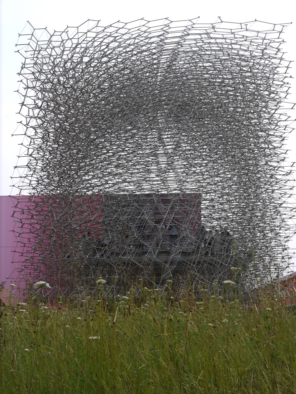
I had to visit the British pavilion twice before I could get in. On my first attempt the queue for entry was discouragingly long and so I retreated to the coffee cluster - more of which very soon. I am very happy that I returned and managed to get inside on the second attempt. Accessed by a maze, the pavilion is visually stunning - a metal construction that from the distance resembles a huge swarm of bees and which was inspired by the unique role of hives in our ecosystem. The design, which is the work of Wolfgang Buttress combines excellent designs with strong environmental credentials. The accompanying explanations include references to the UK as a hive of industry and standing underneath the pavilion and looking up into the mesh of the "hive" the movement of visitors at the upper level really does resemble bees at work. 

The British pavilion was so popular that stewards were employed to manage the flow of traffic through the heart of the hive, extolling us to keep moving so that more people could enter. As with many of the pavilions, efforts were made to display national cuisine. The Pimms may have been a cliche but the availability of chips was a very nice touch! 

Britain's hive of industry
Which leads me back to coffee. In addition to the stand alone national pavilions,there are also a number of "clusters" based on particular themes. Friends and regular readers will know that my shoes were magnetised to this group of small pavilions which included contributions from Burundi, Dominican Republic, El Salvador, Ethiopia, Guatemala, Kenya, Rwanda, Timor-Leste, Uganda and Yemen. I managed to get a look in just about all of them but lingered in the Ethiopian pavilion where a coffee ceremony was taking place and where it was possible to get a free sip of richly flavoured East African coffee. I spent even more time in the Yemen pavilion where a variety of pieces of "jewellery" were on sale as well as much more interestingly, different types of ground coffee. The aroma of the different blends not only drew me to the pavilion but also resulted in my purchase of half a kilo of Mocha. Happy to pay 15 Euros for my purchase, the salesman attempted to engage me in some good old fashioned middle eastern bartering, assuring me that I wanted to buy three bags for 40 Euros. A kind offer, but I was on Easy Jet with only hand luggage so it was a non-starter. And just so you know I would never fly with them again. Late leaving London and late leaving Milan. No explanations and no apologies. And not even that cheap. There is nothing easy about Easy Jet. The Mocha is delicious in case you are interested and there is also a Lavazza stall in the coffee cluster so it was only polite to enjoy a cup there and a couple of Italian pastries.

Coffee salesmen in Yemen's pavilion
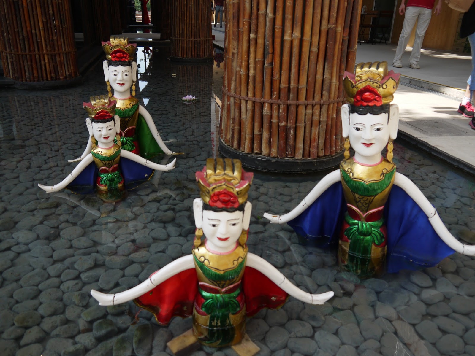
The architecture may have been the main attraction for me but I also enjoyed the surprise and delight of encountering the unexpected. I have already mentioned Poland's secret garden, but add to this some delightful Vietnamese musicians (and the tiny characters on display in the pool outside the Vietnamese pavilion), the floating discs suspended from the ceiling of Brunei's building and the Slovenian swing dancers (and the people in animal costumes who tried to join in, causing some consternation to the dance group). I loved the spectacle of colour that is the exterior of Ecuador's entry, the strange racquet like discs outside the Korean pavilion and the stylish lettering and decorative features of Angola's. I enjoyed the graceful curve of the Uruguayan pavilion and was struck by the huge reflective canopy of Russia's - Big Brother may still be watching us. Oh, and I also liked the Malaysian curry, Israeli ice-cream, Belgian chips, Ethiopian coffee and Italian pastry that helped sustain me throughout the day. 

The Expo runs until October 31st. Is best to buy tickets online in advance to avoid long queues. I managed to combine my visit with two extra days in the city which holds many delights. 

You might also like A Few Days In Milan.

Russia's reflective canopy
Uruguay's pavilion
Korean racquets
Vietnamese figures
Floating discs from Brunei
Stylish lettering from Angola