Showing posts with label Design 1900 - 1939 (Netherlands). Show all posts

Thursday, 28 July 2022

Fré Cohen - the Dutch artist who turned ordinary objects into things of beauty

 “Fré’s work is so interesting. She was skilled in a range of techniques at a time when there were few women in her field and was able to not only promote her beliefs but also to make a living from her work Our exhibition concentrates on her social ideals, feminist views and Jewish inspiration,” says Alice Roegholt, founder and director of the Het Schip Museum in Amsterdam, which is showing an exhibition on the work of the recently rediscovered Dutch graphic designer Fré Cohen.

Fré Cohen at work in her studio, 1934
 

Frederika Sophia Cohen, known as Fré, was born in Amsterdam in 1903, the oldest daughter of diamond workers, Levie and Esther Cohen. When she was still very young, the family moved to Antwerp in search of work only returning to Amsterdam in 1914, at the outbreak of World War I.


Fré showed skill in drawing at an early age and wanted to be a cartoonist. She also developed an early interest in left-wing politics, perhaps influenced by her father’s connections to Netherlands’ social democrat movement. She attended youth camps organised by the Arbeiders Jeugd Centrale, a Social Democrat movement, where she took part in hiking, sports and cultural activities. An image has survived of her at one of the camps, smiling and drawing and surrounded by friends. 


Giro booklet


Despite her artistic promise, it was not until she was 21, in 1924, that she began studying at Amsterdam’s Quellinusschool, first on a part time-basis and later, as a full-time student. She graduated with a Medal of Honour – the first to be issued in the school’s history.  


In 1921 she was hired to design advertisements for the Draka wire and cable factory and later found work with a publishing firm with strong links to the Social Democratic Party. She produced many designs for the party’s printing office, Vooruitgang (progress), and received commissions from trade unions, socialist youth movements and the magazine The Proletarian Woman. She depicted workers in a positive way, showing them as strong and capable, rather than downtrodden victims.


She went on to work for the Amsterdam municipality’s printing firm but left in 1932 to become freelance. She was so successful that by 1933 she was living in her own studio. Her nephew, Ernst Waltemathe, who later became a leading Social Democrat politician in Germany, recalls visiting “my rich aunt” in her studio and receiving gifts from her. 


Brochure for the Social Democrat Party's youth organisation, 1925

Postcard for Amsterdam city cleaning department, c1931

Ex-libris for actress Marie Hamel, 1932


Her work was varied and included book bindings, ex-libris, illustrations, postcards, calendars, playing cards, posters and pamphlets, as well as woodcuts and linocuts. Examples of all are included in the exhibition and show a range of influences including art deco, art nouveau and the Amsterdam School. 


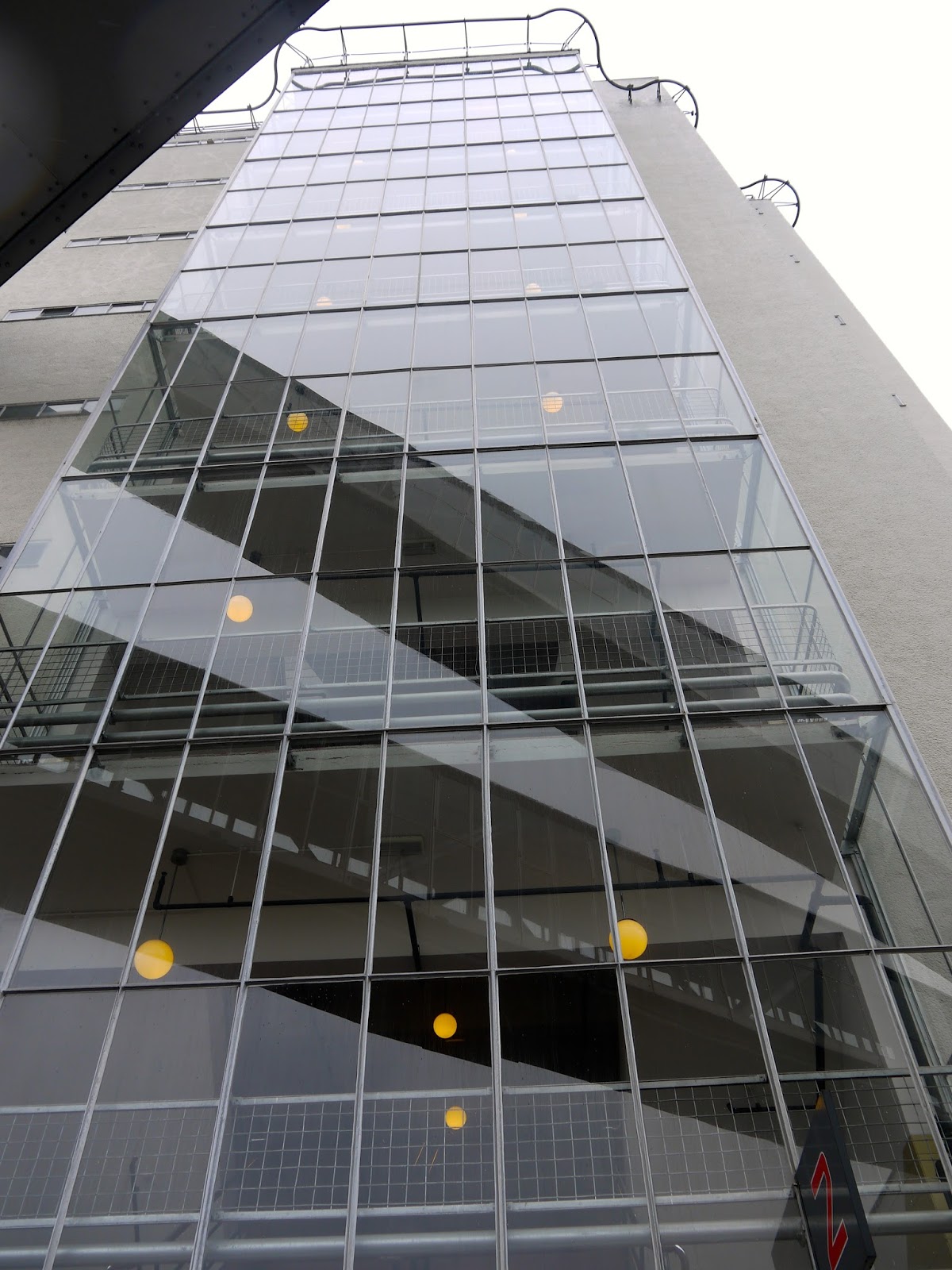
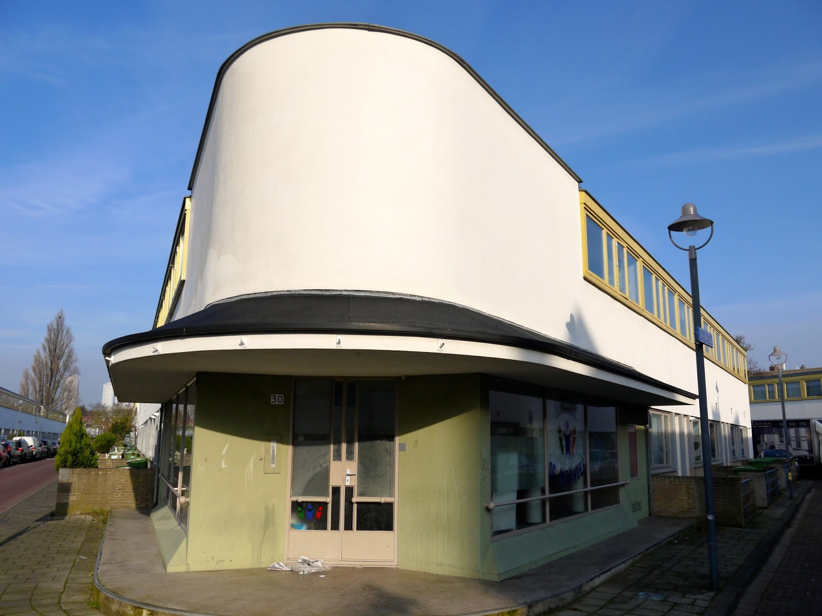
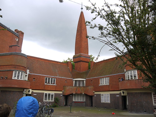
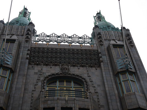
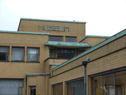
The Amsterdam School movement had been founded by Jewish architect Michel de Klerk at the beginning of the 20th century with the aim of improving the living conditions of the working class. The Het Schip Museum, which is devoted to preserving and promoting the work of the movement, is one of his buildings. Fré not only shared his politics but was one of the leading graphic designers associated with the movement. 


Many of the artworks and objects she designed found their way into the homes of ordinary people, where they have survived until today. “When we announced the exhibition, many people visited us, bringing items that she had designed. We thought they wanted to donate them to us, but no, they just wanted us to see these things that they have treasured for so long,” said Roegholt.


City of Amsterdam coat of arms, 1930


Cohen was not afraid to work in different mediums or new formats. In 1934 she wrote “Each new technique is welcome: book print and lithography, offset and rotogravure. It’s just a matter of choosing the right technique suitable for the product we wish to create.” She exemplified this by making three-dimensional works including boxes and scale models. She also pioneered statistical graphics, in which data is presented with icons rather than numbers. This work included brochures for Schipol Airport and the Amsterdam port, using pictograms to show the growth in passenger numbers and cargo. 


Her reputation spread, and in 1934 the Midlands Master Printers Association invited her to give a series of lectures in the UK. Her subject was ‘Modern Lay-out in Holland,’ and she designed an invitation card especially for the lectures. The December 1934 edition of the Association’s magazine reported that “The lectures were both interesting and helpful and everywhere well attended”. In her presentations, she outlined the history of Dutch printing and spoke about new technology within the industry. 


Fré also explained her design philosophy saying, “My task is to create solid books, to make beautiful printed matter. The ordinary articles we use every day should be things of beauty”. She managed to provoke a minor controversy. The same article reported on her, “…friendly criticism of William Morris’ work, that the decoration tended to become more important apparently than the text” and how this provoked questions about her own use of white space within designs. 


Although Fré enjoyed work, she also liked to have fun and in 1934 took her first holiday in an artists’ village in Ascona, Switzerland. She wrote to a friend describing the town’s bohemian atmosphere saying “…there are vegetarians of all kinds (and) don’t be shocked…principled nudists”. She enjoyed the town’s café culture and painted watercolours there, some of which feature in the exhibition.


Greetings to eternity - watercolour by Fré Cohen


Anscona landscape by Fré Cohen


In the 1930’s her work increasingly showed Jewish influences. Hebrew letters appeared on her ex-libris, magazine covers and political posters. In 1933 she began working with an organisation assisting Jewish refugees from Germany and Austria. It was there that she met writer, journalist and poet, Joseph Gompers. She designed two ex-libris for him. One, from 1934, shows a ploughman and Hebrew text which translates as, ‘the day is short, and the work is much’. The other, produced in 1936, shows a body crushed by a swastika and the words, ‘Ex-libris antisemitism’ in Hebrew.  It was intended for Gompers’ collection of books on antisemitism. The two friends would sometimes go for walks in Amsterdam’s Jewish neighbourhoods. Gompers wrote about these walks in the Nieuw Israeliëtsch Weekblad magazine, under the title Wanderings in Little Jerusalem. Fré contributed the illustrations. 


In 1940, Germany occupied the Netherlands and in October of that year, legislation was passed dismissing Jews from government employment. Fré’s commissions from the municipality ceased but her private commissions continued, including some teaching work at the WH Van Leer Jewish Applied Arts School above the Hollandse Schouwburg (Dutch Theatre). 


In the summer of 1942, the theatre began to be used as a holding point for Jews before deportation. The exhibition includes a photograph taken that year, showing her with a group of the students, and wearing a large Star of David on her coat. 


Life became increasingly dangerous for Dutch Jews, and in 1942, Fré went into hiding, staying at various houses in Amsterdam, Diemen, Rotterdam, Winterwijk and Borne. She continued to keep a busy routine, working on private commissions under the pseudonym ‘Freco’. The exhibition includes playing cards and illustrations for children’s books produced during this period. She also went for walks – running the risk of being recognised and arrested. This troubled her friend, Rie Keesje-Hillebregt, who hid her in Diemen. In a video recording in the show, Rie says, “She dyed her hair red…but she still looked very Jewish.” 


Fré still had hopes and ambitions but was clearly aware of the danger she faced. In 1942, she wrote, “I still have plenty of plans, sketches, and drawings at the ready, for after the war, if we ever live to see the end of it. You sometimes begin to doubt it.” She was right to doubt. On  9th June, 1943, she was captured in Borne and quickly took the poison she had been carrying for such an occasion. After two days in a coma, she died in hospital in Hengelo on June 12th. She is buried in the Jewish cemetery there.


After the war, she was largely forgotten, but in recent years interest in her work and life has grown. Amsterdam’s Stedelijk Museum has a large collection of her graphic works, some of which are included in the Het Schip exhibition which is being enthusiastically received and attracting crowds. Perhaps, more importantly, many of those ‘ordinary articles’ that she designed as ‘things of beauty’ have survived, and are treasured, in the homes of people all over the Netherlands.


Fré Cohen, outside Amsterdam Central Station, c1935


Fré Cohen, Form and Ideals of the Amsterdam School runs until 30th October 2022 at the Het Schip Museum.


An edited version of this article, with additional illustrations, appears in the Summer 2022 edition of Jewish Renaissance Magazine.


All images are reproduced with the kind permission of Het Schip Museum.

Tuesday, 23 February 2016

Dutch Modernism 4 - Fabriek Van Nelle a World Heritage site

During my recent visit to Rotterdam, I was thrilled to be able to visit the Van Nelle factory on the outskirts of the city. The former factory which now houses creative businesses and is used as an events venue was declared a UNESCO World Heritage Site in 2014.  Built between 1925 and 1931, it is probably the modernist masterpiece of iconic Dutch architects, Johannes Brinkman and Leendert Van de Vlugt. You don't have to take my word for this, but perhaps Le Corbusier's 1932 description of it as  "the most beautiful spectacle of the modern age" might convince you! 


The company was founded in 1782 when Johannes and Hendrika van Nelle opened a store in Rotterdam selling coffee, tea and tobacco. In the 19th century the business developed into a factory operation, processing materials imported from the family's plantations in the Java which was then a Dutch colony. By the 1920's the company had outgrown its premises and co-owner Kees van de Leeuw commissioned Brinkman and van der Vlugt to build a new factory. The location for the new building was just outside the centre of the city but with easy access to roads, railways and canals. Visitors from Amsterdam arriving in Rotterdam by train get a good view of the factory, demonstrating its closeness to the railway line.

The factory is supported on a structure of reinforced concrete with facades composed of glass and steel. The preponderance of glass both externally and on the interior partitions and the use of concrete mushroom columns to facilitate this was a response to the client's brief for a modern, progressive work space maximising the use of natural light and providing a comfortable working environment. During my tour of the building it was explained that it was also felt to be beneficial to be able to be observed whilst working, showing that you were pulling your weight and not slacking. Mmm.

This is a very large building, running to 8 storeys and 300 metres in length. Coffee, tea and tobacco were processed in different areas. Raw materials were delivered to the top floors where processing commenced and moved down a floor at a time to complete each stage of the process until they were shipped out from the ground floor and taken to retailers. A series of bridges link the main building and the former stores opposite. These are sloping and were used to transport goods between the different parts of the complex, making use of gravity to do so.


In keeping with the spirit of modernism, the factory was designed with the wellbeing of the workforce in mind. Showers were provided for the workers at a time when very few, if any of them would have had such facilities at home. A cinema, library, light filled cafe and sports facilities were also provided for the workers. This approach was driven in part by van de Leeuw's interest in and commitment to Theosophy. De Leeuw was a close friend of philosopher and one time potential "messiah" of the movement, Jiddu Krishnamurti. However, the altruism only extended so far and the tennis courts in the factory grounds were only for the use of managers! At its height more than 2,000 people worked here - the equivalent of a large village or small town. 


The workforce was segregated with men and women performing different tasks and working separately. The magnificent double staircase pictured in this post was designed to accommodate this regime with one set of stairs for women and one for the men. The reasoning for this was that segregation would prevent romance budding in the workplace and distracting the workers from their labour. How effective this was I don't know but it's not hard to imagine meaningful glances being passed across the central stairwell that led to other things later on!

During my stay in Rotterdam I also visited the Chabot Museum which is housed in the former Kraaijeveld House, another modernist gem. A film was being shown there that included footage from the construction of the factory and of the staff at work. The female staff wore very business-like overalls that would not be out of place in a laboratory and almost all of them sported the fabulously glamorous Marcel wave hairstyle. As well as keeping the genders apart, other measures were taken to remind employees of their social status. Important guests and buyers from retail outlets would be received in a part of the building separate to the parts frequented by the workers. The film also covers de Leeuw's interest in Theosophy. Incidentally de Leeuw, Bertus Sonneveld and Matthijs de Bruyin, also company directs were so impressed with Van de Vlugt's work that they commissioned him to build houses for them. The Sonnenveld House still stands and can be visited today.


The factory came through the Second World War unscathed and over time, the company diversified and included cigarettes, instant puddings and rice amongst their products, continuing to produce goods until 1996. The following year Eric Gude, an expert in converting former industrial sites began working with Wessel de Jonge, a conservation expert in order to preserve the building. Conservation began in 1999 and in addition to its UNESCO World Heritage Status it is also a National Monument in the Netherlands.

It is still possible to see advertisements for Van Nelle products including a huge street sign I noticed whilst strolling in central Rotterdam. It is also possible to find marketing materials and product labels from the 1930's onwards in flea markets around the Netherlands and I picked some up in Amsterdam a few years ago. Visits to the factory can be arranged by contacting Archiguides.

Unfortunately the dark skies and driving sleet  on the day of my visit impacted on my pictures - low light photography is not my forte! A good reason to return in the summer.

Some more pictures...


Friday, 19 February 2016

Dutch Modernism 3 - Kiefhoek, Rotterdam's modernist social housing project

There are several examples of social housing estates in Europe, constructed in the 1930's and designed to improve the living conditions of working class people. Rotterdam has one of the most famous examples of this development - the Kiefhoek Estate, originally constructed between 1925 and 1930 and designed by the iconic Dutch architect J.J.P.Oud


The Kiefhoek included 300 dwellings, a church, two shops, a hot water service and outside playground spaces to provide facilities for the many children that lived in the original development. The estate's plan is based on rows of standardised two storey homes with up to three bedrooms. Oud took an extremely functional approach to designing the dwellings, all of which have white rendered facades but adding a splash of colour with the red doors, yellow window frames and blue gates that are a clear reference to the De Stijl school of design. The only other external decoration occurs on homes at the end of streets where a small rounded balcony is positioned above the front door. 


The buildings that visitors see today are not the original structures. Over the years the buildings deteriorated, primarily due to the lack of robust foundations and between 1989 and 1995, the estate was demolished and rebuilt. The smaller dwellings were combined to adapt them to modern day living and to make more space available. Architect Wytze Patijn was responsible for the re-design which maintains the original exterior features, including the iconic and much photographed curved shop units at the end of the Kiefhoek's longest streets. The units are no longer used as shops, serving instead as spaces for community activity. They would make great gallery spaces. Today's residents have access to a large selection of shops a short walk away on the main road.


It is still possible to see how the estate's earlier residents lived as one of the buildings has been reconstructed as a single unit, true to the original design and to act as a museum. The tiny two storey dwellings, less than four metres wide accommodated a living room, small kitchen, toilet and up to three bedrooms. Dutch working class families could be large and many of the units would have been home to families with up to six children sleeping in bunk beds, some with three levels! The tiny ground floor lounge included a storage cupboard for food and crockery and it is difficult to see how the larger families could have comfortably sat down together.  However, there is no doubt that the Kiefhoek offered far superior housing to that lived in by most Dutch working families during this period, with separate kitchen space including a shallow ceramic sink which would be deemed fashionable today and even some outside space at the rear where vegetables could be grown to help make the family income go further.


The upper floor was reached by a spiral staircase. In the museum, the steps and the bannister are painted yellow, again referencing De Stijl, and the colour is set off by the natural light that floods in via the windows at the top of the stairs. This natural light is supplemented by a sliding frosted glass window that separates the stairwell from the third bedroom - an ingenious touch demonstrating the thought that went into the design process. Oud's original proposals also included a shower under the stairs, a folding ironing board and an extra sink in the hall, but these were rejected.

As well as the two shops and playgrounds, the estate had its own church. Also designed by Oud, it is a modernist box with the same white rendered facade as the homes but with some additional decorative features, including the beautiful stained glass windows and the stylised lettering on the front which includes its date of construction - 1929. The stained glass designs are echoed in the windows of one of the houses opposite - a window that also has two very alive and large parrots on display! 


The estate can be visited at any time but to see inside the museum, its necessary to make an appointment and take a guided tour from Rotterdam's UrbanGuides who can also make arrangements for tours of other architectural landmarks in the city.

You might also like Dutch Modernism 1 - Rotterdam's Cafe de Unie , another of J.J.P. Oud's works, Modernism and Elegant Swimming Pool and Red Vienna which includes the Werkbund Siedlung (where there is another Oud building), Karl Mark Hof and Raben Hof estates in Vienna and Czech Modernism 3 - Prague's Baba Estate.

Monday, 15 February 2016

Dutch Modernism 2 - The Kraaijeveld House in Rotterdam's Museum Park

Rotterdam's Museum Park is home to some of the Netherlands' premier museums and cultural attractions. Amongst them are a number of villas designed and built in the modernist style in the 1930's as homes for wealthy Dutch families. Most of these villas now serve other functions. The Chabot Museum which houses the works of Dutch expressionist painter and sculptor Henk Chabot, began life as the Kraaijeveld House and was built for the family of the same name in 1938.


C.H. Kraaijeveld, director of the Volker Dredging Company commissioned a modern white villa to be built on the corner of Jongkindstraat in late 1937. His son J. Kraaijeveld developed the early plans before architect Gerrit W. Baas was employed to find a suitable plot for the house and to work up detailed proposals. Baas' skills were in-demand and already working on other projects, he secured the help of Leonard Stokla, another Rotterdam architect to assist him on this additional commission. Stokla had been involved in the design of a functionalist building on Coolsingel, the city's main shopping street and was sympathetic to Baas' modernist principles. This may explain the fantastic modernist design that resulted from their co-operation, despite Mrs. Kraaijeveld's request for a "not too modern" house!

Between them the architects produced one of the most beautiful residential buildings in the Netherlands, and probably in the whole of Europe. The first thing that visitors see when approaching the building is the delicious curved protruding balcony with its protective shelf which gives shelter in bad weather and also allows light to stream though from above through a series of small openings. When the final designs were submitted for planning permission, this wonderful feature drew objections for the nearby Bojimans Museum, but thankfully Baas refused to omit the curve or even to compromise by replacing the closed balustrade with an open railing. Good for him - and for us. Through much manoeuvring and possibly some calling in of favours by the client, the committee eventually approved the plans and construction began on 9th May 1938.


Although strictly a modernist, Baas was clearly not averse to adding some non-functional, decorative features as evidenced by the rounded bay window on the side of the building and the black tiled plinth which is in dramatic contrast to the clean white of the rest of the exterior. The architects also dealt with the interior design of the villa. This included oak panelling in the living spaces, built in furniture in colours that complemented the overall design and advising on fabrics furnishings and lighting. The furniture included tubular steel designs and Giso lamps whilst a sundial was placed in the front garden. These matters were not included in the original brief. Clearly the temptation to expand one's brief is not a recent phenomenon.

The house came through the 1940 bombing of Rotterdam without damage - although doubtless the basement bomb shelter was used during the attack. The family lived in the villa until 1969 when it was sold to the Contact Group for the Metalworking Industry (CWM). During the time that the company occupied the villa almost all of the original internal features disappeared. The new owners also extended the property, adding a sympathetically designed additional floor for more office space. The extension was designed by Ernest Groosman and was implemented in 1975. 


The building changed hands again in 1991 when a Mr and Mrs Grootveld-Paree acquired it, planning to use it as a museum for the works of Henk Chabot. Further internal modifications were made to enable the villa to fulfil its new function but these were carried out sensitively with for example, some of the plant for the necessary environmental controls being located on the roof, hidden from public view. These works also included elements of restoration, dealing with long standing issues of damp, leakage and cracks, replacing many of the glass bricks and repairing the steel window frames.  

February in Rotterdam can be cold, wet and bleak. On the day of my visit the skies were cloudy and grey but with occasional breaks of sunshine that showed the former Kraaijeveld house in all its glory. I must return to Rotterdam to see the building in the summer light.

The museum puts on temporary exhibitions as well as exhibiting Chabot's works. It has a small shop that offers a number of books, postcards and other items of memorabilia for sale. When I visited last week a short film showing the construction of another iconic modernist Rotterdam building - the Van Nelle factory - was being shown. I managed to visit the factory before eating Rotterdam and will write about it separately.  


Saturday, 13 February 2016

Dutch Modernism 1 - Rotterdam's Cafe De Unie


Cafe de Unie opened in 1925 on Coolsingel, in the centre of Rotterdam. The striking facade with its bright blue, red and yellow colours is a typical De Stijl design, bringing to mind the works produced by artist Piet Mondrian in the 1920's.  Cafe de Unie was the work of J.J.P. Oud who was commissioned by Rotterdam Municipal Housing to design a temporary structure to plug a gap between two larger nineteenth century buildings. It was intended that the building would stand for ten years and then be demolished.

Strikingly modern, the building was in sharp contrast to its neighbours and was not well received by everyone. Architect, painter and designer J. Verheul was particularly offended, going so far as to say "a more outrageous disfigurement of a street front is in my view inconceivable". Fortunately this was not the opinion of all of Rotterdam's residents and the bright colours, stylised lettering, illuminated signage and vertical letterbox, the cafe attracted a loyal following.


De Unie outlived its intended ten years but was destroyed during the German bombing of May 14th 19401 that reduced much of the city to rubble. However, that was not the end for the cafe and in the 1970's, discussion started about re-creating the building. A proposal was developed to rebuild on Oude Binnenweg but in 1986 it was reconstructed at Mauritsweg 35. For a number of years the cafe also delivered a programme of cultural activity in the auditorium at the rear of the building.

Oud was one of the leading modernist architects of the 1920's and 1930's having been one of the participants at the Weissenhofsiedlung exhibition in Stuttgart in 1927 and was considered to be in the same league as Le Corbusier, van der Rohe and Walter Gropius. Following the Weissenhofsiedlung exhibition which modelled a new approach to social housing, Oud was responsible for a working class housing project in Rotterdam - the Kiefhoek estate completed in 1930 and which I will write about separately. 

In later years his work attracted criticism for his use of decorative features, felt by some to be in conflict with the spirit of modernism.  It is interesting that Oud had already left the De Stijl group by the time he designed the cafe's facade, having quarrelled with Theo van Doesburg, the group's leader. He also designed another building in this style - the manager's hut at Oud Mathenesse. The hut was also intended to be temporary but still stands and although less well known than de Unie, it is considered to be a textbook example of the De Stijl movement.  

Although the original building is gone, the new de Unie gives visitors the opportunity to see something of 1920's Rotterdam. And just as important, I enjoyed my coffee and cinnamon biscuits there earlier this week...

Monday, 17 June 2013

Picture Post 19 - Holtkamp's Patisserie, Amsterdam

Amsterdam by Yekkes

Holtkamp's Cake and Pastry Shop at Vijzelgracht 15, is proof that small can be beautiful. Very beautiful. The Holtkamp family founded a bakery on this spot in 1885 but in 1926, the son of the first baker commissioned Amsterdam School architect  Piet Kramer to re-fit the shop in modern style. The result was what visitors see today -  18 square metres of varnished light oak fittings,  dark coromandel wood and stained glass.

 It is said that Kramer wanted to give the impression of entering Ali Baba's cave as customers came through the door, and like that gentleman's cave, Holtkamp's is full of treasure. That first baker's son clearly had good taste and an eye for the moderne as he also secured the services of artist Pieter den Besten to paint the wave like illustrations above the shelves. And these are not the only visual treasures. There is shelf upon shelf of cake, biscuits and pastries that would tempt even the most demanding of customers. And there is proof of this - as you enter you can see the coat of arms of the Dutch Royal Family above the door, proudly displayed by the owners to indicate that the shop is an appointed supplier to the Court.

In 2002, the store closed for one month to enable careful and sympathetic restoration overseen by architect Wim Quist. Mr. Quist has a very hard act to follow. Kramer and den Besten were leading lights amongst the highly influential Amsterdam School architects and their associates in the 1920's. Just before completing this small but perfectly formed project (!), Kramer had finished work on the de Bijenkhof department store in Den Haag and den Besten was responsible for amongst other things, the murals inside the stunning Tuschinksi Theatre on Amsterdam's Reguliersbreestraat - both highly significant achievements in Dutch art and architecture. Mr. Quist can be proud of himself. The shop is a delight.

Of course, with my architectural interests I love this little shop but I also love the products - some of which are beautiful enough to be considered works of art in themselves! In addition to this, there is a very welcoming atmosphere with the staff knowing many of the customers and making tourists (like me) feel very welcome by giving a smiling "yes" when I asked if it was OK to take photographs. 

Amsterdam is full of little treasures like this - many of which are undiscovered by the majority of the city's visitors. You can read more about the amazing achievements of Dutch artists and architects before the Second World War here and here, whilst you can see more photographs of Amsterdam's architectural heritage here. I suddenly feel the need for coffee...and cake!

Thursday, 3 May 2012

The Golden Age of Dutch Design part 2...The Amsterdam School, de Klerk, Berlage, Toorop and more

I wrote earlier about Dutch design in the first part of the 20th century, focusing particularly on graphic design, advertising and the wonderful Wendingen magazine. This was one aspect of the creative explosion in Dutch design during this period and one which rivalled developments across Europe. At the same time, the Netherlands saw significant and unique developments in architecture.

Dutch society is generally thought of as being socially conscious and somewhat egalitarian, but at the beginning of the 20th Century many working class Dutch lived in unhealthy housing, lacking basic amenities and suffering from the lower life expectancy, disease and social ills that come with inadequate housing. The organised labour movement campaigned strenuously on this issue resulting in 1901 in the Housing Act which legislated against construction of poor quality housing and made provision for major slum clearance. Also included in the measures identified by the Act were subsidies for not for profit housing associations to provide good quality housing for the poorest citizens and which led to detailed urban plans such as H.P. Berlage's "Plan Zuid" for South Amsterdam.

Although many architects were active and influential at this time, the two most outstanding practitioners were Michel de Klerk and the already mentioned Hendrik Petrus Berlage. De Klerk was born into a large, poor Dutch Jewish family in 1884. He was discovered by, and became apprentice to, the architect Eduard Cuypers at the age of 14. Whilst working for Cuypers he developed friendships with Piet Kramer and Jo van der Mey and together they laid the foundations for what became known as the "Amsterdam School". Kramer and de Klerk augmented this training with additional classes at the Industrial School for the Working Class, whilst de Klerk also spent some time in Scandinavia.

The Amsterdam School had ambitious political ideals, expressed through the use of strong colours, robust materials and extensive ornamentation. The School also attempted to determine the surroundings that their work was set in, including establishing elegant squares, secluded residential streets and beautiful outdoor areas.

Amsterdam by Yekkes


Perhaps the most famous example of this, and de Klerk's masterpiece is the De Spaarndamerbuurt (pictured above) neighbourhood in the Westpark district of Amsterdam. Designed in 1919 and built primarily for workers form the nearby docks, de Klerk presented a breathtaking design in brick and in striking colours, completely moving away from the earlier standard rows of small, bleak buildings. The star of the show is without doubt the third block, now known as Het Schip (the ship) and located on the Spaarndamerplantsoen. Containing 102 dwellings, a small meeting room and a post office and located on an extremely challenging triangular site, de Klerk produced a building of curves, angles, unexpected courtyards and unique ornamentation.

The former post office, located in the curved end of the building on the Spaarndamerplantsoen, now houses a museum, known as "Het Schip" or, the ship, in reference to the look and shape of the block. The museum offers guided tours which include a short walk around the exterior of the building with key and unusual features being pointed out as well as a visit to one of the apartments, restored to its original state as designed by de Klerk. The occupants would have been working class people with a regular, although low income and would have been members of the socialist housing association - Eigen Haard, who according to my guide on my last visit, still maintain an interest in the surrounding properties.

The interior of the apartment includes period furniture, kitchen equipment and utensils, items of clothing, books, children's toys and a range of ephemera from the 1920's. On the day I visited there was torrential rain and the home had an atmosphere of warm cosiness on a very dark and cold afternoon. It was easy to imagine the difference between living in this property and living in the former slum housing that many working class Dutch people had lived in prior to the Housing Act.

De Klerk also designed the former post office in the tip of the building. The interior is truly stunning with a grand private enclosure for local people to use the public telephone, adventurous colours including deep violet and lavender and an arched, rectangular ceiling above an irregular trapezoid office. This little postal palace was part of De Klerk's philosophy of providing the best quality services and facilities for the working class, is the hub of the museum and can be explored by visitors as well as forming part of the tour.

Across the road from the post office is a cafe from the same period. The cafe was a great place to take refuge on a very rainy day, sells good snacks, strong coffee and tempting cakes. I particularly like the understated decorative features including the door handles and building number. You can buy postcards, books about the museum and the Amsterdam School in the cafe although the museum has a larger selection of similar items for sale.

De Klerk's other most well known work and continuing legacy is the former Scheepvarthuis (Shipping House) on Prins Hendrikdadde opposite Amsterdam Central Station. Regarded as a masterpiece of the Amsterdam School, the lead architect was Jo van der Mey, but with major contributions from De Klerk, Kramer and sculptor Hildo Krop. Built in 1913 for Amsterdam's major shipping companies, the building now houses the Grand Hotel Amrath.

The building is entered through a narrow doorway up a short flight of stairs which gives on to a small reception area, dramatic staircase and highly decorated glass ceiling above the atrium. The hotel has stunning original interiors making extensive use of glass, wood and metal much of which shows art deco and art nouveau influences. You don't have to be a guest at the hotel to use the bar, coffee lounge or restaurant and all are worth a look. The hotel staff are welcoming and when I asked they were happy for me to walk upstairs and to take photographs. There is a weekly guided tour on Sundays - bookings can be made through Het Schip Museum.

The Amsterdam School architects also delivered some smaller scale but equally beautiful projects. One of my favourites is the irresistible Holtkamp's Cake and Pastry Shop on Vijzelgracht, Amsetrdam. The shop was founded in 1885 but was made over in Amsterdam School style in 1928 by Piet Kramer. Small, but beautiful, I love this place which packs in a huge range of lovely things, has friendly ladies working there who allow visitors to take photos (and sometimes give them a CD rom about the history of the shop!) and also features artist Pieter den Besten's wave patterns and snail designs on the walls!

Den Besten is a bit of a hero of mine having been responsible for some of the murals inside the absolutely fabulous Tuschinksi Cinema on Reguliersbreestraat (detail pictured below). Founded by Polish Jew, Abram Icek Tuschinksi who on route for the USA in 1903 decided to remain in the Netherlands. He quickly became successful opening four cinemas in Rotterdam, with the Tuschinksi following in 1921 as his crowning achievement. Mr. Tuschinksi was very determined that his Amsterdam cinema would be a success and when it looked as if  it would be without an organ for its official opening he managed to persuade the owner of a Brussels cinema to dismantle a Wurlitzer organ and send it to Amsterdam!

Amsterdam by Yekkes


The cinema mixes art deco, art nouveau and Amsterdam School techniques and elements and was a resounding success from opening. Unfortunately the occupying Germans quite liked it too and took it over soon after occupying the Netherlands, renamed it and imprisoned Tuschinksi. He was deported to Auschwitz in 1942 where he was murdered. After the war the cinema had its original name restored and still draws in big audiences today keen to enjoy the atmosphere of this most beautiful building.

Another Amsterdam School gem is the Jacob Obrechtplein synagogue, designed by architect Harry Elte. The exterior of the synagogue is a typical brick Amsterdam School building, although much more angular than many of the other buildings - and almost brutalist in the solid and sheer external walls, but the interior (which I have only seen in photographs) is a very different story. Filled with beautiful glass features and with exquisite black and gold art deco style tiled features behind the bimah and over the ark, it is truly stunning.

On my last visit to Amsterdam I tried to gain entry on Friday afternoon and spoke at length with an Israeli yeshivah bocher in a mixture of Hebrew and English. He was waiting for the shammes to arrive for a meeting. The shammes was a grumpy looking elderly Russian immigrant who spoke neither English nor Hebrew but told my other new acquaintance that I could only come in for services. I couldn't come back on the Friday evening and knew I wouldn't be able to take photos on Shabbat so didn't get back - but I will certainly be trying again in future!

The synagogue (detail pictured below) is located in South Amsterdam, formerly a very Jewish area, was consecrated in 1928 and restored in 1997. Architect Elte suffered the fate of 90% of Dutch Jewry during the war, was deported and murdered at Auschwitz in 1944. He also designed the former nursing home at 98 Nieuwe Keizersgracht and the Chewre Schul on Nieuwe Kerkstraat and several other buildings elsewhere in the Netherlands.

Amsterdam by Yekkes


Working at the same time as De Klerk and his colleagues, Henrick Petrus Berlage had a somewhat different philosophy. He believed that the use of ornament in architecture should not be a goal in itself. Working initially in an historical style, he changed tack and moved towards rationalism, using geometrical plans and shapes. This included incorporating elements of construction as decorative features. Examples of this are leaving strengthening iron bars or pillars uncovered and making them decorative features and using bands of different coloured bricks on the inner walls of buildings. He also had a philosophy of using materials in a pure form, for example not bending wood or dyeing it to change its colour and appearance.

As with Hoffman in Austria and Mucha in Belgium, Berlage also designed furniture for his buildings. This furniture was sold at the Het Binnenhuis store in Amsterdam, established by Berlage and his business partner J. van den Bosch. Numerous other leading designers came to make items for sale there and the store became a focus for the Dutch version of art nouveau.

Berlage's first major rational style project was the Beurs in Amsterdam - the former home of the stock exchange. The Beurs was built between 1898 and 1903, sits in the centre of the city on Damrak, and operates today as a conference and events centre. The interior of the building is more decorative than many of his later works and includes some wonderful symbolist mosaics in the cafe which is popular with both locals and visitors.

Amsterdam by Yekkes

The mosaics are the work of Jan Toorop, (one is pictured above) the leading Dutch symbolist painter born in Java in 1858. They were formerly located in the entrance to the Beurs and are wonderful examples of politically oriented art, following themes of female emancipation and workers progress.  Titled "Past" "Present" and "Future" they show working conditions developing from slavery through to modern day and on to a future utopia. Interestingly the political message is mixed with religious symbolism - probably because at the time he produced these works Toorop was renouncing anarchism and embracing Catholicism.

It is also possible to visit another famous Berlage building - the Gemeentemuseum in Den Haag (pictured below). Although the exhibitions are interesting and the collection good, the building is the star of the show. The exterior still looks incredibly modern  with the green topped yellow bricks demonstrating Berlage's rationalist theories about decoration. The interior is equally inspiring with what might be described as "calm" art nouveau features including little recesses in the main ground floor hall where reds, whites and greens are used as contrasts on plain or tiled walls.

Den Haag by Yekkes