I wrote earlier about Dutch design in the first part of the 20th century, focusing particularly on graphic design, advertising and the wonderful Wendingen magazine. This was one aspect of the creative explosion in Dutch design during this period and one which rivalled developments across Europe. At the same time, the Netherlands saw significant and unique developments in architecture.
Dutch society is generally thought of as being socially conscious and somewhat egalitarian, but at the beginning of the 20th Century many working class Dutch lived in unhealthy housing, lacking basic amenities and suffering from the lower life expectancy, disease and social ills that come with inadequate housing. The organised labour movement campaigned strenuously on this issue resulting in 1901 in the Housing Act which legislated against construction of poor quality housing and made provision for major slum clearance. Also included in the measures identified by the Act were subsidies for not for profit housing associations to provide good quality housing for the poorest citizens and which led to detailed urban plans such as H.P. Berlage's "Plan Zuid" for South Amsterdam.
Although many architects were active and influential at this time, the two most outstanding practitioners were Michel de Klerk and the already mentioned Hendrik Petrus Berlage. De Klerk was born into a large, poor Dutch Jewish family in 1884. He was discovered by, and became apprentice to, the architect Eduard Cuypers at the age of 14. Whilst working for Cuypers he developed friendships with Piet Kramer and Jo van der Mey and together they laid the foundations for what became known as the "Amsterdam School". Kramer and de Klerk augmented this training with additional classes at the Industrial School for the Working Class, whilst de Klerk also spent some time in Scandinavia.
The Amsterdam School had ambitious political ideals, expressed through the use of strong colours, robust materials and extensive ornamentation. The School also attempted to determine the surroundings that their work was set in, including establishing elegant squares, secluded residential streets and beautiful outdoor areas.
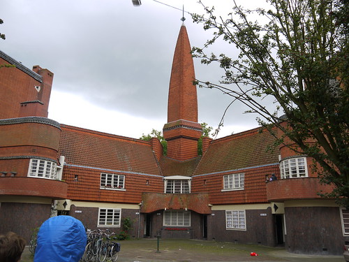
Perhaps the most famous example of this, and de Klerk's masterpiece is the De Spaarndamerbuurt (pictured above) neighbourhood in the Westpark district of Amsterdam. Designed in 1919 and built primarily for workers form the nearby docks, de Klerk presented a breathtaking design in brick and in striking colours, completely moving away from the earlier standard rows of small, bleak buildings. The star of the show is without doubt the third block, now known as Het Schip (the ship) and located on the Spaarndamerplantsoen. Containing 102 dwellings, a small meeting room and a post office and located on an extremely challenging triangular site, de Klerk produced a building of curves, angles, unexpected courtyards and unique ornamentation.
The former post office, located in the curved end of the building on the Spaarndamerplantsoen, now houses a museum, known as "Het Schip" or, the ship, in reference to the look and shape of the block. The museum offers guided tours which include a short walk around the exterior of the building with key and unusual features being pointed out as well as a visit to one of the apartments, restored to its original state as designed by de Klerk. The occupants would have been working class people with a regular, although low income and would have been members of the socialist housing association - Eigen Haard, who according to my guide on my last visit, still maintain an interest in the surrounding properties.
The interior of the apartment includes period furniture, kitchen equipment and utensils, items of clothing, books, children's toys and a range of ephemera from the 1920's. On the day I visited there was torrential rain and the home had an atmosphere of warm cosiness on a very dark and cold afternoon. It was easy to imagine the difference between living in this property and living in the former slum housing that many working class Dutch people had lived in prior to the Housing Act.
De Klerk also designed the former post office in the tip of the building. The interior is truly stunning with a grand private enclosure for local people to use the public telephone, adventurous colours including deep violet and lavender and an arched, rectangular ceiling above an irregular trapezoid office. This little postal palace was part of De Klerk's philosophy of providing the best quality services and facilities for the working class, is the hub of the museum and can be explored by visitors as well as forming part of the tour.
Across the road from the post office is a cafe from the same period. The cafe was a great place to take refuge on a very rainy day, sells good snacks, strong coffee and tempting cakes. I particularly like the understated decorative features including the door handles and building number. You can buy postcards, books about the museum and the Amsterdam School in the cafe although the museum has a larger selection of similar items for sale.
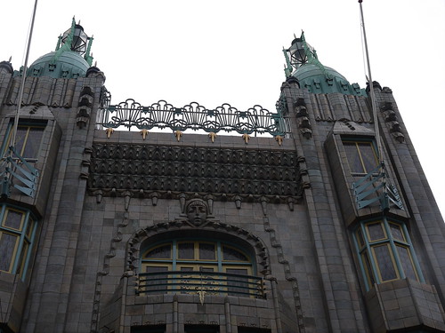
De Klerk's other most well known work and continuing legacy is the former Scheepvarthuis (Shipping House) on Prins Hendrikdadde opposite Amsterdam Central Station. Regarded as a masterpiece of the Amsterdam School, the lead architect was Jo van der Mey, but with major contributions from De Klerk, Kramer and sculptor Hildo Krop. Built in 1913 for Amsterdam's major shipping companies, the building now houses the Grand Hotel Amrath.
The building is entered through a narrow doorway up a short flight of stairs which gives on to a small reception area, dramatic staircase and highly decorated glass ceiling above the atrium. The hotel has stunning original interiors making extensive use of glass, wood and metal much of which shows art deco and art nouveau influences. You don't have to be a guest at the hotel to use the bar, coffee lounge or restaurant and all are worth a look. The hotel staff are welcoming and when I asked they were happy for me to walk upstairs and to take photographs. There is a weekly guided tour on Sundays - bookings can be made through Het Schip Museum.
The Amsterdam School architects also delivered some smaller scale but equally beautiful projects. One of my favourites is the irresistible Holtkamp's Cake and Pastry Shop on Vijzelgracht, Amsetrdam. The shop was founded in 1885 but was made over in Amsterdam School style in 1928 by Piet Kramer. Small, but beautiful, I love this place which packs in a huge range of lovely things, has friendly ladies working there who allow visitors to take photos (and sometimes give them a CD rom about the history of the shop!) and also features artist Pieter den Besten's wave patterns and snail designs on the walls!
Den Besten is a bit of a hero of mine having been responsible for some of the murals inside the absolutely fabulous Tuschinksi Cinema on Reguliersbreestraat (detail pictured below). Founded by Polish Jew, Abram Icek Tuschinksi who on route for the USA in 1903 decided to remain in the Netherlands. He quickly became successful opening four cinemas in Rotterdam, with the Tuschinksi following in 1921 as his crowning achievement. Mr. Tuschinksi was very determined that his Amsterdam cinema would be a success and when it looked as if it would be without an organ for its official opening he managed to persuade the owner of a Brussels cinema to dismantle a Wurlitzer organ and send it to Amsterdam!
The cinema mixes art deco, art nouveau and Amsterdam School techniques and elements and was a resounding success from opening. Unfortunately the occupying Germans quite liked it too and took it over soon after occupying the Netherlands, renamed it and imprisoned Tuschinksi. He was deported to Auschwitz in 1942 where he was murdered. After the war the cinema had its original name restored and still draws in big audiences today keen to enjoy the atmosphere of this most beautiful building.
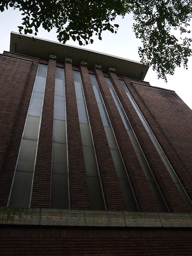
Another Amsterdam School gem is the Jacob Obrechtplein synagogue, designed by architect Harry Elte. The exterior of the synagogue is a typical brick Amsterdam School building, although much more angular than many of the other buildings - and almost brutalist in the solid and sheer external walls, but the interior (which I have only seen in photographs) is a very different story. Filled with beautiful glass features and with exquisite black and gold art deco style tiled features behind the bimah and over the ark, it is truly stunning.
On my last visit to Amsterdam I tried to gain entry on Friday afternoon and spoke at length with an Israeli yeshivah bocher in a mixture of Hebrew and English. He was waiting for the shammes to arrive for a meeting. The shammes was a grumpy looking elderly Russian immigrant who spoke neither English nor Hebrew but told my other new acquaintance that I could only come in for services. I couldn't come back on the Friday evening and knew I wouldn't be able to take photos on Shabbat so didn't get back - but I will certainly be trying again in future!
The synagogue (detail pictured below) is located in South Amsterdam, formerly a very Jewish area, was consecrated in 1928 and restored in 1997. Architect Elte suffered the fate of 90% of Dutch Jewry during the war, was deported and murdered at Auschwitz in 1944. He also designed the former nursing home at 98 Nieuwe Keizersgracht and the Chewre Schul on Nieuwe Kerkstraat and several other buildings elsewhere in the Netherlands.
Working at the same time as De Klerk and his colleagues, Henrick Petrus Berlage had a somewhat different philosophy. He believed that the use of ornament in architecture should not be a goal in itself. Working initially in an historical style, he changed tack and moved towards rationalism, using geometrical plans and shapes. This included incorporating elements of construction as decorative features. Examples of this are leaving strengthening iron bars or pillars uncovered and making them decorative features and using bands of different coloured bricks on the inner walls of buildings. He also had a philosophy of using materials in a pure form, for example not bending wood or dyeing it to change its colour and appearance.
As with Hoffman in Austria and Mucha in Belgium, Berlage also designed furniture for his buildings. This furniture was sold at the Het Binnenhuis store in Amsterdam, established by Berlage and his business partner J. van den Bosch. Numerous other leading designers came to make items for sale there and the store became a focus for the Dutch version of art nouveau.
Berlage's first major rational style project was the Beurs in Amsterdam - the former home of the stock exchange. The Beurs was built between 1898 and 1903, sits in the centre of the city on Damrak, and operates today as a conference and events centre. The interior of the building is more decorative than many of his later works and includes some wonderful symbolist mosaics in the cafe which is popular with both locals and visitors.
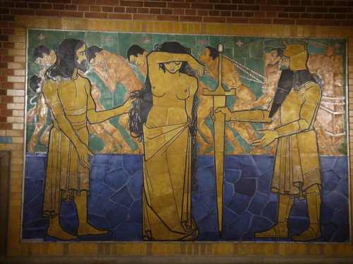
The mosaics are the work of Jan Toorop, (one is pictured above) the leading Dutch symbolist painter born in Java in 1858. They were formerly located in the entrance to the Beurs and are wonderful examples of politically oriented art, following themes of female emancipation and workers progress. Titled "Past" "Present" and "Future" they show working conditions developing from slavery through to modern day and on to a future utopia. Interestingly the political message is mixed with religious symbolism - probably because at the time he produced these works Toorop was renouncing anarchism and embracing Catholicism.
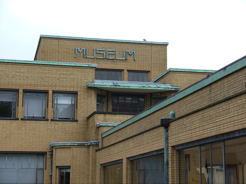
It is also possible to visit another famous Berlage building - the Gemeentemuseum in Den Haag (pictured below). Although the exhibitions are interesting and the collection good, the building is the star of the show. The exterior still looks incredibly modern with the green topped yellow bricks demonstrating Berlage's rationalist theories about decoration. The interior is equally inspiring with what might be described as "calm" art nouveau features including little recesses in the main ground floor hall where reds, whites and greens are used as contrasts on plain or tiled walls.
No comments:
Post a Comment