On my recent visit to North America, I spent three days in Toronto, primarily to attend some friends' wedding. Whilst that was clearly the highlight of my trip, I did manage to fit in a few other goodies, including the fabulous Sophie Milman concert at the Massey Hall. (You can read about the concert and see Sophie perform here).
Ms Milman's concert was excellent and is very close to the top of my list of Toronto favourite experiences, but running this very close was a wonderful Sunday evening walking tour of art deco buildings in the central business district, led by author, blogger and art deco expert and devotee Tim Morawetz. Tim has authored the excellent and beautifully illustrated "Toronto Art Deco" which is highly recommended to all art deco fans whether you are visiting Canada or not.
Our walk included a number of wonderful examples of deco buildings from the 1920's and 1930's at a time when Canada was asserting its national character and becoming more independent. This was also a period of growth in the city with the expanding population needing more civic buildings to serve its needs. The peak building years came between 1928 and 1930 when over a three year period more than $120 million Canadian was spent on construction within the city. This slowed significantly in the early 1930's during the depression.
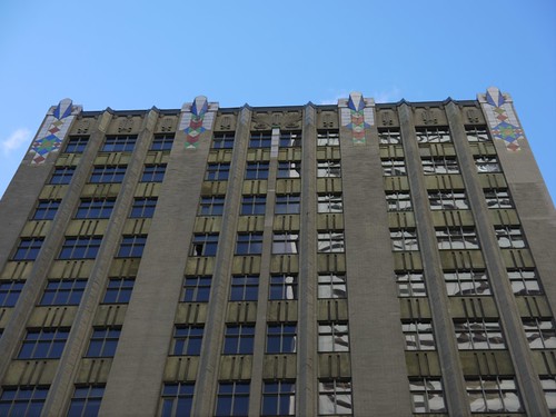
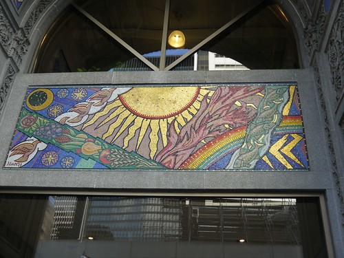
Toronto was a socially conservative city and this often extended to architecture, with a more understated approach to the style than in the United States and in other countries. However, my absolute favourite from our walk somewhat bucks this trend. The Concourse Building at 100 Adelaide West Street (pictured above, with detail of the entry pictured below), built in 1928 and designed by architects Lawrence C. Baldwin and Gerald E.D. Greene as a rental office space, has stunning mosaics at street level depicting themes of Canadian industry and nature. The mosaics were created by Group of Seven artist J.E.H.McDonald and his son Thoreau.
The base of the building is more Romanesque than Deco with a two storey rounded arch doorway leading to a barrel vaulted lobby. However, above this, the shaft is pure Deco with uninterrupted lines of beige bricks and metal sashed-windows. The facade also features green tinted stone spandrel panels which give additional character to the Concourse. The main brick piers are crowned with brightly coloured geometric designed ceramic tiles. The designs are heavily influenced by Native American art and bring an additional touch of splendour to this wonderful building. Tim explained that there is some doubt over the future of the building since the developer owning the site wishes to redevelop it into 21st century office space which would mean the demolition of all but the first three floors with the "re-creation" of the rest of the tower to suit this purpose. The future of the Concourse is not clear but what an appalling loss this would be to the Toronto skyline.
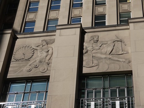
Another truly stunning building is the Bank of Nova Scotia at 44 King Street West. The initial designs were produced between 1929 and 1936 by John M. Lyle before being redesigned and completed by Mathers and Haldenby, Beck and Eadie from 1946-51. This was to have been the major work of Lyle's career, but sadly he did not live to see the end of the project and the final design was completed by the successor team, retaining his overall massing to a large extent but considerably simplifying the facade. The highlights of this very imposing building are a series of relief carved panels above the first floor facade, designed by sculptor Frederick Winkler and depicting figures from classical mythology (two of which are pictured below). The light was unusually good at 7.30 on a June Sunday evening and it was possible to take some very clear pictures.
Close by at 234 Bay Street is the former Toronto Stock Exchange, designed by George, Moorhouse and Samuel Maw, and built in 1937. The frontal exterior of the building is again impressive, with windows and doorways recessed into the pink granite base and buff limestone walls. The building has a number of Streamline Moderne elements including wide limestone speed-stripes above the base and narrower granite stripes at the level of the trade floor ceiling. The long narrow windows above ground floor level are the windows of the former trading floor and show exactly the height of that very imposing room, but perhaps the most striking external feature is the frieze above first floor level showing men engaged in various kinds of commerce and industry.
The Stock Exchange moved to another building in 1992 and the Design Exchange which exists to promote Canadian design currently holds a lease on the premises. Interesting enough in itself, the building is now surrounded by later buildings - the TD Centre Towers and a separate pavilion. Two of the Towers and the pavilion were designed by Mies van der Rohe!
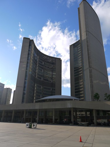
Our walk ended in the square outside the "new" City Hall (pictured below) which opened in 1965 and was designed by Finnish architect Viljo Revell. The building features a "pod" which houses the Council chamber where the political debates and decision making take place. The pod is sheltered by two towers of unequal height that house the staff, and can be accessed through the ground level doors or by a ramp that leads from the public square to the upper level. I am fascinated by this building, especially at night when coloured lighting is used to show it off. It was possible to have a quick look inside - which is a must if you can - and to see the galleried effect around the pod as the building moves upwards and the "upside down teapot lid" shape of the pod itself.
There are many more Deco buildings spread around the city and I understand that Tim has registered some walks with the City of Toronto. It is definitely worth checking to see if any of his walks are available if you are visiting Toronto, and if you can't go, then read the book!
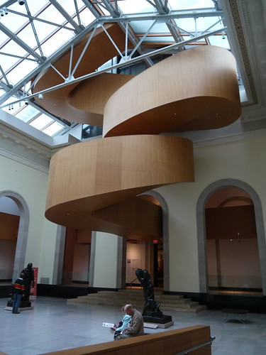
Another great Toronto experience was the Frank Gehry designed Art Gallery of Ontario (or AGO). The building is a bold glass fronted modern structure with a huge collection of Canadian art including many works of the Group of Seven and wonderful examples of Inuit and First Nation (the term used in Canada for original peoples) art. The gallery is also able to attract major international shows and at the time of my visit was hosting a Picasso exhibition. However, for me the show was completely stolen by the fantastic twisted wooden staircase in the main atrium (pictured below) which is a work of art in itself and had a large group of admirers throughout the time I was in the gallery. There is also a very nice (albeit a little expensive) restaurant in the Gallery called "Franks". Nice for a treat but take your credit card or plenty of cash with you.
I was especially keen to view the Canadian collection. I knew of the Group of Seven, but not very much about them and was fascinated to learn that following the First World War, this group (and others) strove to establish a truly "Canadian" art. In the case of the Seven it was expressed in views of the Canadian countryside, in rich greens and browns and a focus on nature. Interestingly, none of the Seven were women although the Montreal based Beaver Hall Group, which included several women regularly exhibited with them.
One interesting feature was a large glass cabinet full of "merchandise" with Group of Seven works reproduced on them and dating from several different decades. The items included mugs, magazine covers, calendars, stamps, t-shirts and more. Also in the cabinet was a beautiful collection of the Group's exhibition catalogues from the 1920's. These held my view for a long time!
The group's work is enormously important to the development of Canadian art, but was not without its critics, including for its apparent depiction of a pristine, uninhabited land when in fact the land had been lived on for thousands of years. John Lyman criticised the group saying its approach was too "nationalistic" and in 1939 he founded his own, rival Contemporary Arts Society based in Montreal.
One of Lyman's paintings was among my favourites from the AGO. "Portrait of Marcelle" from 1935, an oil on canvas work showing a striking woman with aquiline nose and viciously plucked eyebrows dressed in vibrant green hat and scarf and yellow and blue sweater and skirt, with book before her but open on a blank page to match her empty expression. I spent a long time looking at this picture but have been unable to find it anywhere on the internet or as a postcard in the large gallery shop. If anyone knows where to find a poster or postcard please let me know!
I was also very struck by some of Emily Carr's works, especially "Trees in the sky" an oil on canvas from 1939. The strangely shaped trees appear to have dead or dying cold grey stumps adjacent to thin, but climbing saplings surrounded by rich blues and greens and lush vegetation perhaps showing the renewal of nature and of life. Ms Carr had close links with the Group of Seven, although she was not a member. She also had an interest in First Nation peoples and their traditions and this can clearly be seen from "Kispiax Village" painted in oil on canvas in 1929 and which shows a number of totems and warm looking houses again set against lush green vegetation.
One of the things I especially enjoyed about the AGO was the opportunity to chance upon small exhibitions focused on particular themes, often tucked away in little side rooms or even corridors. I have already written about being a bit of a Russophile (see here and here) so imagine my delight on discovering a small exhibition entitled "Constructing Utopia" , featuring books and posters from revolutionary Russia, 1910-40, original "spartakiada" postcards by Gustav Klutsis showing idealised young Russians taking part in sporting activity as well as a handful of propaganda posters by Mayakovsky and Malevich. What a find!
I spent a good two and a half hours in the gallery (not counting time in the restaurant and the shop) and could easily have spent at least another hour enjoying the collections. Definitely somewhere to return to should I be in the city again.
As usual, food played a major part in my travels. The wedding had involved a ten course Chinese banquet (and very good it was too), but this didn't stop me sampling the delights of a restaurant in Toronto's Chinatown where I enjoyed some pretty fantastic chicken and black bean sauce - not exactly a "challenging" dish but cooked really well, extremely tasty and a good portion. The name of the restaurant? - Asian Legend - on Dundas Street. Apparently this family owned business now has three other outlets in the city and its not hard to see why. On the Sunday evening, the restaurant was completely full (mainly with Chinese people) and some kind of function was being held in the downstairs room. I followed my delicious main course with my favourite Chinese dessert - mango pudding. Alright, so its not exactly Chinese and it looks like something for kids. Give me break, I was on holiday.
I also came across a small but beautiful cafe called Arabesque. Located on College Street in Little Italy, Arabesque serves middle eastern food including the Lebanese version of kibbeh, falafel, humous, babaganoush and lots of sticky sweet lovely pastries to a few tables in what feels like someone's front room. This cafe is owned by a Lebanese family, is tiny, cosy and very welcoming, providing a place for locals to drop in, chat, read the papers and enjoy the great food together with, you guessed it, very strong coffee. The coffee was made to order - spiced with cardamoms, arabic style and served on a handled tray with a small pouring pot. Wonderful and totally unexpected! And as if that isn't enough, there is also a small deli service with herbs, spices, pickles, fresh ground coffee and other goodies for sale so you can recreate the experience at home. I want one in London!
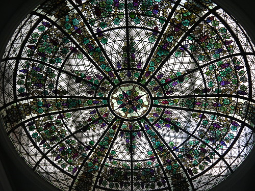
I managed to fit in another couple of sites - Casa Loma, the largest private home in Ontario and built in a variety of styles from 1911-14, for soldier and financier Sir Henry Pellatt by E.J. Lennox who also designed the old Toronto City Hall. It features 98 rooms, 2 towers, a beautiful terrace and garden and is open to visitors to wander at their will or to take a guided tour. The highpoint of my Saturday morning visit to Casa Loma was the stunning glass ceiling in the conservatory (pictured below) with its beautiful purple and green floral images. The room was being set out for what looked like a wedding so only a quick peek was possible but the ceiling alone made it worth visiting the house for me. There is also a collection, based mainly on the Pellatt family and which includes lots of weapons, so not really my thing, but the building itself is interesting and has been used for many films and TV shows. There are also some stunning views of the Toronto skyline from the windows.
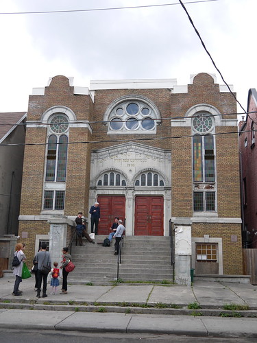
A quick look around Kensington Market, where just about any cuisine you can think of is available as well as some interesting independent stores, and a walk through the (mostly closed) Little Italy and Little Portugal on the Sunday morning was interesting as was a quick stop off to look inside the Minsk Synagogue built in 1930 (pictured below) by and for immigrants from, well, Minsk. Deceivingly small (the outside is quite imposing) the synagogue is well maintained with several arts and crafts features. It still serves a local but much reduced community with most Jews having moved to other parts of the city. A group of old men chatting on the steps of the building waved me in when I asked for a look and told me to "go right ahead" when I asked about taking pictures. This was fairly typical of my overall experience of Toronto, with people being friendly, welcoming and extremely helpful.
I haven't said yet that it rained for most of the time I was there but that would probably be churlish...and I didn't get time to see Niagara Falls which is only a short distance away. Next time.
Ms Milman's concert was excellent and is very close to the top of my list of Toronto favourite experiences, but running this very close was a wonderful Sunday evening walking tour of art deco buildings in the central business district, led by author, blogger and art deco expert and devotee Tim Morawetz. Tim has authored the excellent and beautifully illustrated "Toronto Art Deco" which is highly recommended to all art deco fans whether you are visiting Canada or not.
Our walk included a number of wonderful examples of deco buildings from the 1920's and 1930's at a time when Canada was asserting its national character and becoming more independent. This was also a period of growth in the city with the expanding population needing more civic buildings to serve its needs. The peak building years came between 1928 and 1930 when over a three year period more than $120 million Canadian was spent on construction within the city. This slowed significantly in the early 1930's during the depression.

Toronto was a socially conservative city and this often extended to architecture, with a more understated approach to the style than in the United States and in other countries. However, my absolute favourite from our walk somewhat bucks this trend. The Concourse Building at 100 Adelaide West Street (pictured above, with detail of the entry pictured below), built in 1928 and designed by architects Lawrence C. Baldwin and Gerald E.D. Greene as a rental office space, has stunning mosaics at street level depicting themes of Canadian industry and nature. The mosaics were created by Group of Seven artist J.E.H.McDonald and his son Thoreau.
The base of the building is more Romanesque than Deco with a two storey rounded arch doorway leading to a barrel vaulted lobby. However, above this, the shaft is pure Deco with uninterrupted lines of beige bricks and metal sashed-windows. The facade also features green tinted stone spandrel panels which give additional character to the Concourse. The main brick piers are crowned with brightly coloured geometric designed ceramic tiles. The designs are heavily influenced by Native American art and bring an additional touch of splendour to this wonderful building. Tim explained that there is some doubt over the future of the building since the developer owning the site wishes to redevelop it into 21st century office space which would mean the demolition of all but the first three floors with the "re-creation" of the rest of the tower to suit this purpose. The future of the Concourse is not clear but what an appalling loss this would be to the Toronto skyline.

Another truly stunning building is the Bank of Nova Scotia at 44 King Street West. The initial designs were produced between 1929 and 1936 by John M. Lyle before being redesigned and completed by Mathers and Haldenby, Beck and Eadie from 1946-51. This was to have been the major work of Lyle's career, but sadly he did not live to see the end of the project and the final design was completed by the successor team, retaining his overall massing to a large extent but considerably simplifying the facade. The highlights of this very imposing building are a series of relief carved panels above the first floor facade, designed by sculptor Frederick Winkler and depicting figures from classical mythology (two of which are pictured below). The light was unusually good at 7.30 on a June Sunday evening and it was possible to take some very clear pictures.

Close by at 234 Bay Street is the former Toronto Stock Exchange, designed by George, Moorhouse and Samuel Maw, and built in 1937. The frontal exterior of the building is again impressive, with windows and doorways recessed into the pink granite base and buff limestone walls. The building has a number of Streamline Moderne elements including wide limestone speed-stripes above the base and narrower granite stripes at the level of the trade floor ceiling. The long narrow windows above ground floor level are the windows of the former trading floor and show exactly the height of that very imposing room, but perhaps the most striking external feature is the frieze above first floor level showing men engaged in various kinds of commerce and industry.
The Stock Exchange moved to another building in 1992 and the Design Exchange which exists to promote Canadian design currently holds a lease on the premises. Interesting enough in itself, the building is now surrounded by later buildings - the TD Centre Towers and a separate pavilion. Two of the Towers and the pavilion were designed by Mies van der Rohe!
Our walk ended in the square outside the "new" City Hall (pictured below) which opened in 1965 and was designed by Finnish architect Viljo Revell. The building features a "pod" which houses the Council chamber where the political debates and decision making take place. The pod is sheltered by two towers of unequal height that house the staff, and can be accessed through the ground level doors or by a ramp that leads from the public square to the upper level. I am fascinated by this building, especially at night when coloured lighting is used to show it off. It was possible to have a quick look inside - which is a must if you can - and to see the galleried effect around the pod as the building moves upwards and the "upside down teapot lid" shape of the pod itself.

There are many more Deco buildings spread around the city and I understand that Tim has registered some walks with the City of Toronto. It is definitely worth checking to see if any of his walks are available if you are visiting Toronto, and if you can't go, then read the book!
Another great Toronto experience was the Frank Gehry designed Art Gallery of Ontario (or AGO). The building is a bold glass fronted modern structure with a huge collection of Canadian art including many works of the Group of Seven and wonderful examples of Inuit and First Nation (the term used in Canada for original peoples) art. The gallery is also able to attract major international shows and at the time of my visit was hosting a Picasso exhibition. However, for me the show was completely stolen by the fantastic twisted wooden staircase in the main atrium (pictured below) which is a work of art in itself and had a large group of admirers throughout the time I was in the gallery. There is also a very nice (albeit a little expensive) restaurant in the Gallery called "Franks". Nice for a treat but take your credit card or plenty of cash with you.
I was especially keen to view the Canadian collection. I knew of the Group of Seven, but not very much about them and was fascinated to learn that following the First World War, this group (and others) strove to establish a truly "Canadian" art. In the case of the Seven it was expressed in views of the Canadian countryside, in rich greens and browns and a focus on nature. Interestingly, none of the Seven were women although the Montreal based Beaver Hall Group, which included several women regularly exhibited with them.
One interesting feature was a large glass cabinet full of "merchandise" with Group of Seven works reproduced on them and dating from several different decades. The items included mugs, magazine covers, calendars, stamps, t-shirts and more. Also in the cabinet was a beautiful collection of the Group's exhibition catalogues from the 1920's. These held my view for a long time!
The group's work is enormously important to the development of Canadian art, but was not without its critics, including for its apparent depiction of a pristine, uninhabited land when in fact the land had been lived on for thousands of years. John Lyman criticised the group saying its approach was too "nationalistic" and in 1939 he founded his own, rival Contemporary Arts Society based in Montreal.
One of Lyman's paintings was among my favourites from the AGO. "Portrait of Marcelle" from 1935, an oil on canvas work showing a striking woman with aquiline nose and viciously plucked eyebrows dressed in vibrant green hat and scarf and yellow and blue sweater and skirt, with book before her but open on a blank page to match her empty expression. I spent a long time looking at this picture but have been unable to find it anywhere on the internet or as a postcard in the large gallery shop. If anyone knows where to find a poster or postcard please let me know!

I was also very struck by some of Emily Carr's works, especially "Trees in the sky" an oil on canvas from 1939. The strangely shaped trees appear to have dead or dying cold grey stumps adjacent to thin, but climbing saplings surrounded by rich blues and greens and lush vegetation perhaps showing the renewal of nature and of life. Ms Carr had close links with the Group of Seven, although she was not a member. She also had an interest in First Nation peoples and their traditions and this can clearly be seen from "Kispiax Village" painted in oil on canvas in 1929 and which shows a number of totems and warm looking houses again set against lush green vegetation.
One of the things I especially enjoyed about the AGO was the opportunity to chance upon small exhibitions focused on particular themes, often tucked away in little side rooms or even corridors. I have already written about being a bit of a Russophile (see here and here) so imagine my delight on discovering a small exhibition entitled "Constructing Utopia" , featuring books and posters from revolutionary Russia, 1910-40, original "spartakiada" postcards by Gustav Klutsis showing idealised young Russians taking part in sporting activity as well as a handful of propaganda posters by Mayakovsky and Malevich. What a find!
I spent a good two and a half hours in the gallery (not counting time in the restaurant and the shop) and could easily have spent at least another hour enjoying the collections. Definitely somewhere to return to should I be in the city again.
As usual, food played a major part in my travels. The wedding had involved a ten course Chinese banquet (and very good it was too), but this didn't stop me sampling the delights of a restaurant in Toronto's Chinatown where I enjoyed some pretty fantastic chicken and black bean sauce - not exactly a "challenging" dish but cooked really well, extremely tasty and a good portion. The name of the restaurant? - Asian Legend - on Dundas Street. Apparently this family owned business now has three other outlets in the city and its not hard to see why. On the Sunday evening, the restaurant was completely full (mainly with Chinese people) and some kind of function was being held in the downstairs room. I followed my delicious main course with my favourite Chinese dessert - mango pudding. Alright, so its not exactly Chinese and it looks like something for kids. Give me break, I was on holiday.
I also came across a small but beautiful cafe called Arabesque. Located on College Street in Little Italy, Arabesque serves middle eastern food including the Lebanese version of kibbeh, falafel, humous, babaganoush and lots of sticky sweet lovely pastries to a few tables in what feels like someone's front room. This cafe is owned by a Lebanese family, is tiny, cosy and very welcoming, providing a place for locals to drop in, chat, read the papers and enjoy the great food together with, you guessed it, very strong coffee. The coffee was made to order - spiced with cardamoms, arabic style and served on a handled tray with a small pouring pot. Wonderful and totally unexpected! And as if that isn't enough, there is also a small deli service with herbs, spices, pickles, fresh ground coffee and other goodies for sale so you can recreate the experience at home. I want one in London!
I managed to fit in another couple of sites - Casa Loma, the largest private home in Ontario and built in a variety of styles from 1911-14, for soldier and financier Sir Henry Pellatt by E.J. Lennox who also designed the old Toronto City Hall. It features 98 rooms, 2 towers, a beautiful terrace and garden and is open to visitors to wander at their will or to take a guided tour. The highpoint of my Saturday morning visit to Casa Loma was the stunning glass ceiling in the conservatory (pictured below) with its beautiful purple and green floral images. The room was being set out for what looked like a wedding so only a quick peek was possible but the ceiling alone made it worth visiting the house for me. There is also a collection, based mainly on the Pellatt family and which includes lots of weapons, so not really my thing, but the building itself is interesting and has been used for many films and TV shows. There are also some stunning views of the Toronto skyline from the windows.

A quick look around Kensington Market, where just about any cuisine you can think of is available as well as some interesting independent stores, and a walk through the (mostly closed) Little Italy and Little Portugal on the Sunday morning was interesting as was a quick stop off to look inside the Minsk Synagogue built in 1930 (pictured below) by and for immigrants from, well, Minsk. Deceivingly small (the outside is quite imposing) the synagogue is well maintained with several arts and crafts features. It still serves a local but much reduced community with most Jews having moved to other parts of the city. A group of old men chatting on the steps of the building waved me in when I asked for a look and told me to "go right ahead" when I asked about taking pictures. This was fairly typical of my overall experience of Toronto, with people being friendly, welcoming and extremely helpful.

I haven't said yet that it rained for most of the time I was there but that would probably be churlish...and I didn't get time to see Niagara Falls which is only a short distance away. Next time.
No comments:
Post a Comment